

Clients:
Roderick (Rod) Conwi: Consultant
Description:
Rod approached me to develop branding for his consulting LLC, seeking a modern and corporate aesthetic. Our focus was primarily on creating a business card that would reflect his professional image. Throughout the process, Rod and I maintained close communication to ensure that we captured his vision accurately.
Working closely together, we iterated on various design elements until we achieved a result that met his expectations. In addition to designing his business card, I also developed his logo, color palette, typography, and letterhead to ensure consistency across all branding materials.
Our collaboration was both in-person and virtual, allowing for seamless communication and feedback exchanges. By the end of our collaboration, we were both highly satisfied with the outcome, knowing that we had successfully created branding that represented Rod's consulting LLC in a modern and corporate style.
Initial Sketches
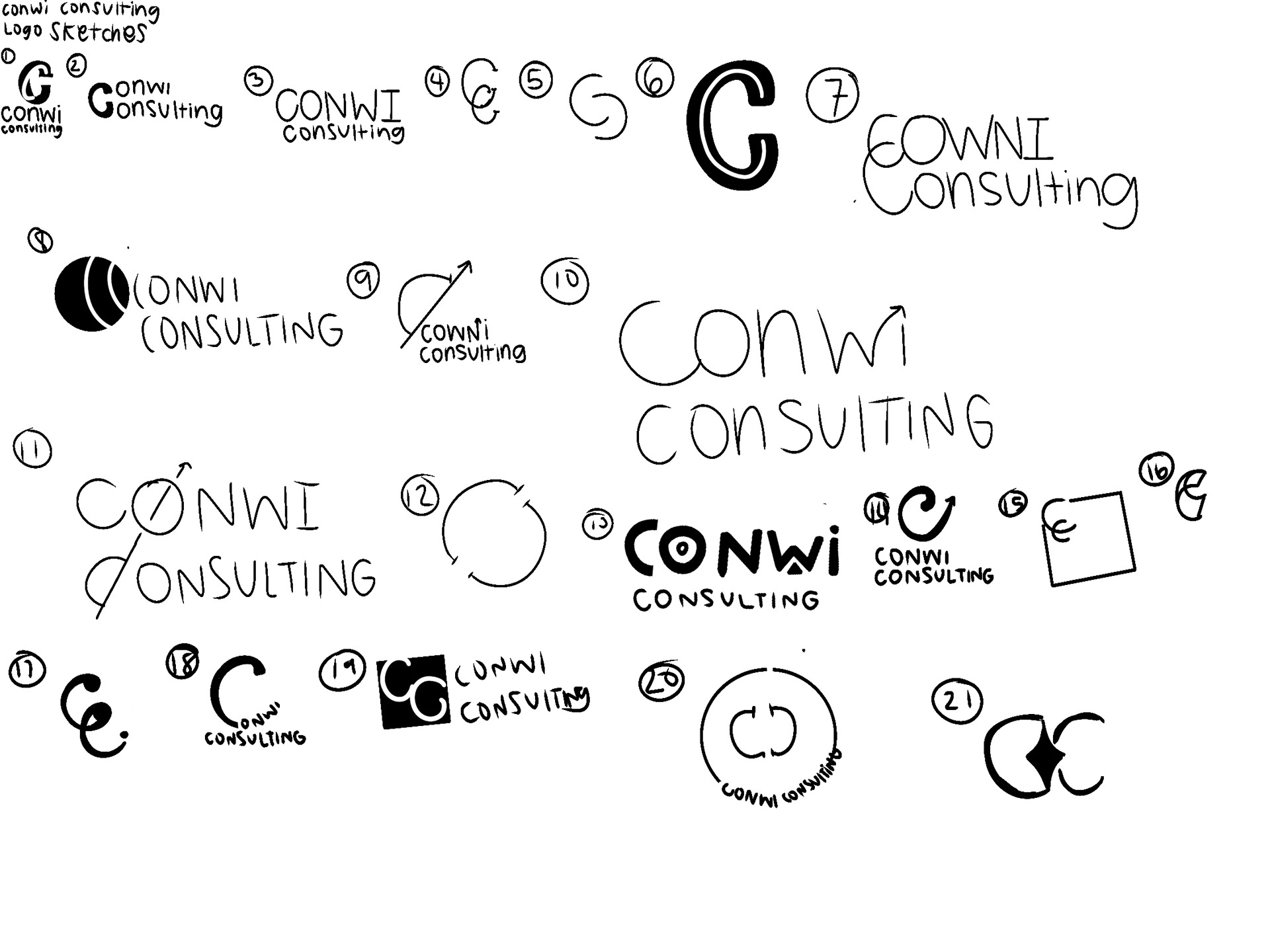
Starting each project with initial sketches is a smart approach—it allows for the exploration of multiple ideas quickly. For Rod's consulting LLC branding, I began with several rough sketches to generate a variety of concepts. Since Rod had indicated a preference for icon-based logos in the logo audit I provided him, I focused on incorporating icons into these initial sketches.
Digital Logos Step One
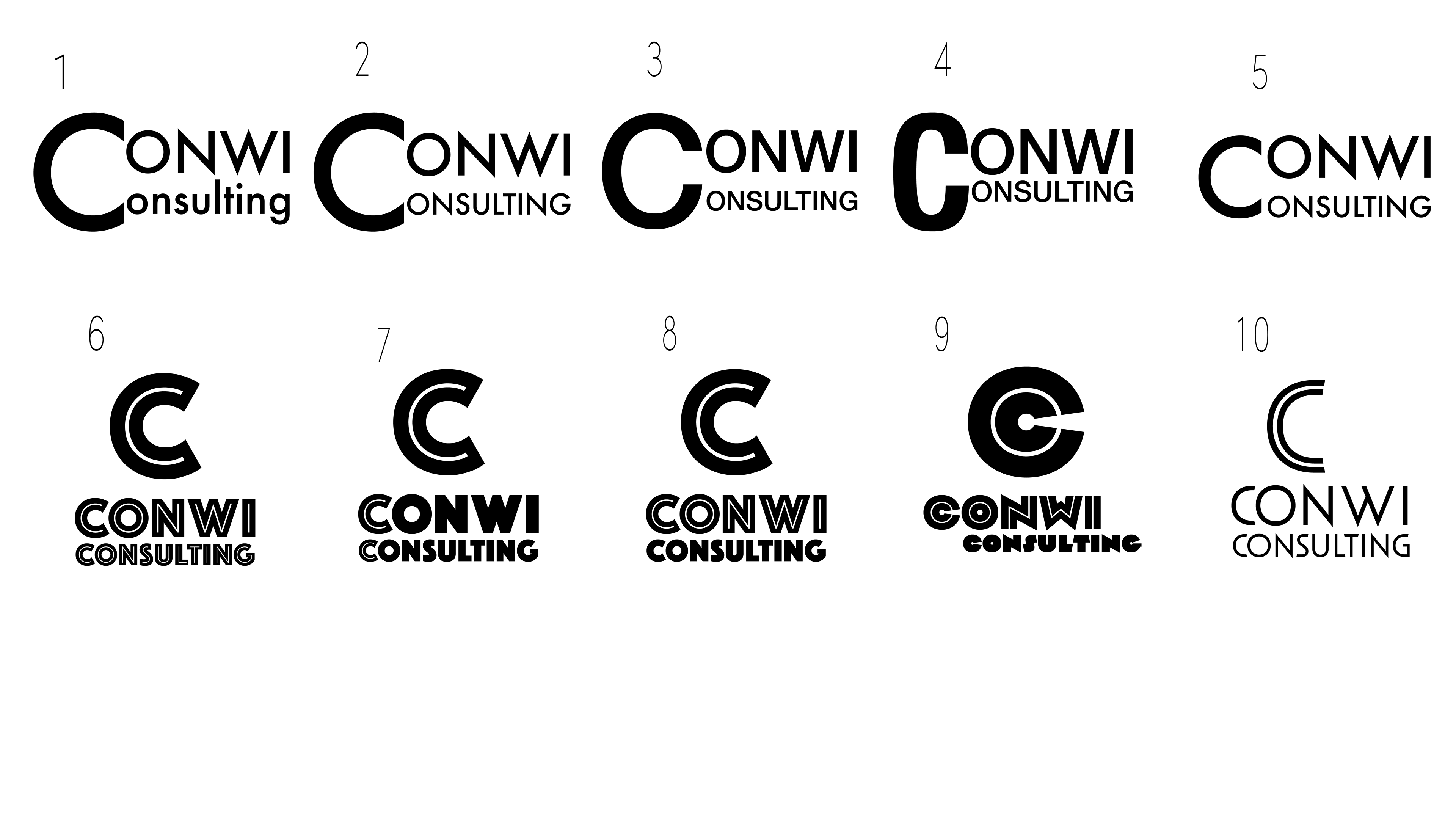
Here are ten examples of the digital logos I've created. Once my client selects their preferred sketches, I meticulously refine each concept, paying attention to every detail. With each logo iteration, I move closer to achieving the desired end result, ensuring alignment with the client's vision and maintaining a high level of quality and professionalism.
Final Logo and Variations


The icon of the logo is a stacked “C.” Of course the two C’s represent “Conwi” and “Consulting,” but there is also so much more than what meets the eye. Each ‘C’ represents a significant concept or value that the company stands for: collaboration and creativity.
“CONWI CONSULTING” is typed in all capitals for exceptional readability. The typeface is easy to read to allow the viewer to quickly digest the design.
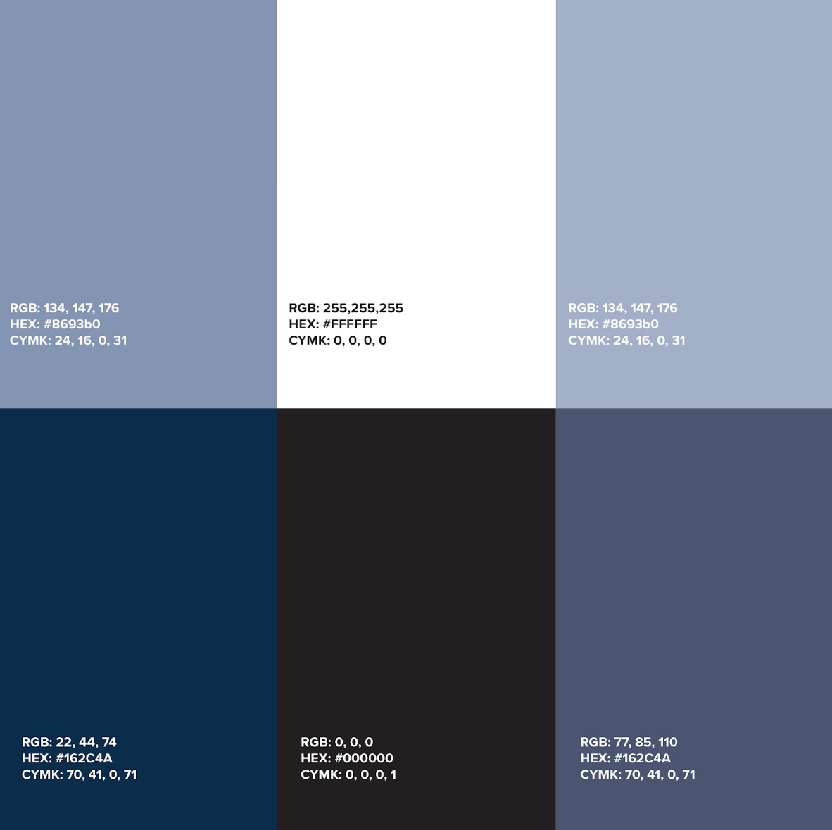
Conwi Consulting chose a color palette consisting of four shades of cool blue and navy blue for several strategic reasons:
Brand Personality: Blue hues are often associated with qualities like trustworthiness, professionalism, and reliability. By selecting shades of blue, particularly cool tones and navy blue, the brand can convey a sense of stability and competence, appealing to customers who prioritize these traits.
Versatility: Blue is a versatile color that can be used across a range of applications and contexts. By incorporating multiple shades, the brand gains flexibility in design, allowing for variation while maintaining visual consistency. This versatility ensures that the color palette remains adaptable to different marketing materials, products, and environments. Overall, selecting a color palette with four shades of cool blue and navy blue can help a brand establish a strong visual identity, communicate key attributes, and connect with its target audience on both rational and emotional levels.
Pattern
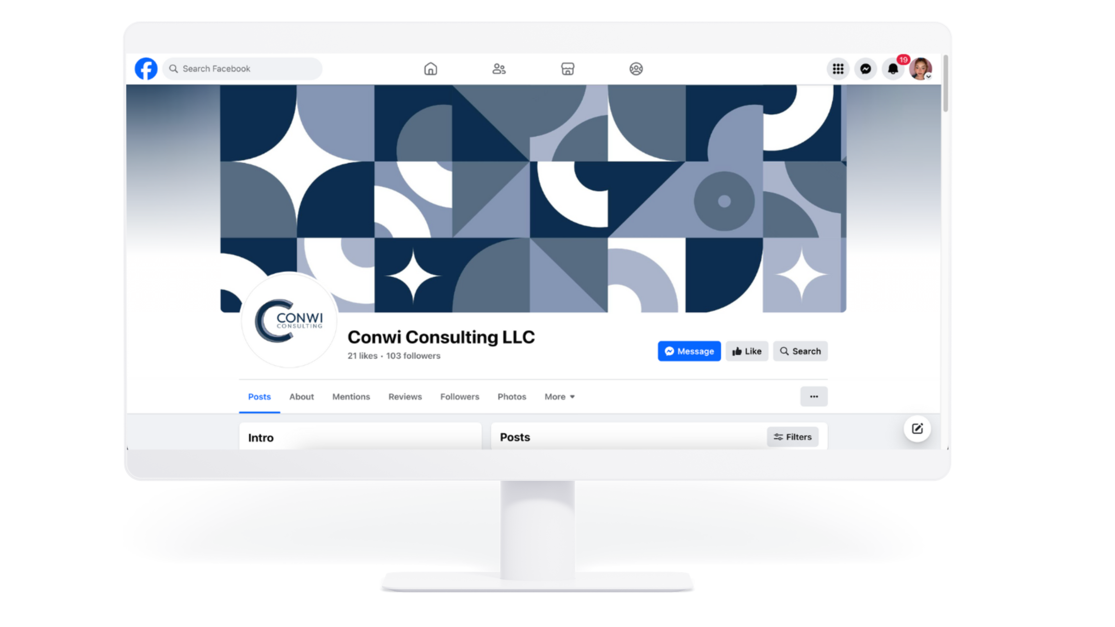
Conwi Conuslting’s geometric blue pattern is a striking visual representation of its identity, exuding modernity and sophistication. Comprised of intersecting lines and shapes, the pattern creates a sense of movement and dynamism, while the cool blue tones evoke a feeling of trust and stability. This geometric motif is not only aesthetically pleasing but also serves as a powerful symbol of the brand’s
values: precision, innovation, and reliability. Incorporated across various touchpoints, from packaging to digital platforms, the pattern establishes a cohesive visual language that reinforces the brand’s identity. Whether adorning product packaging, serving as a background on the brand’s website, or featured in marketing materials, the geometric blue pattern instantly communicates the brand’s presence and sets it apart from competitors. Consistent use of this distinctive design element fosters brand recognition and loyalty, as customers come to associate the pattern with the brand’s commitment to quality and forward-thinking. Our geometric pattern should be used on everything our brand touches.
values: precision, innovation, and reliability. Incorporated across various touchpoints, from packaging to digital platforms, the pattern establishes a cohesive visual language that reinforces the brand’s identity. Whether adorning product packaging, serving as a background on the brand’s website, or featured in marketing materials, the geometric blue pattern instantly communicates the brand’s presence and sets it apart from competitors. Consistent use of this distinctive design element fosters brand recognition and loyalty, as customers come to associate the pattern with the brand’s commitment to quality and forward-thinking. Our geometric pattern should be used on everything our brand touches.