

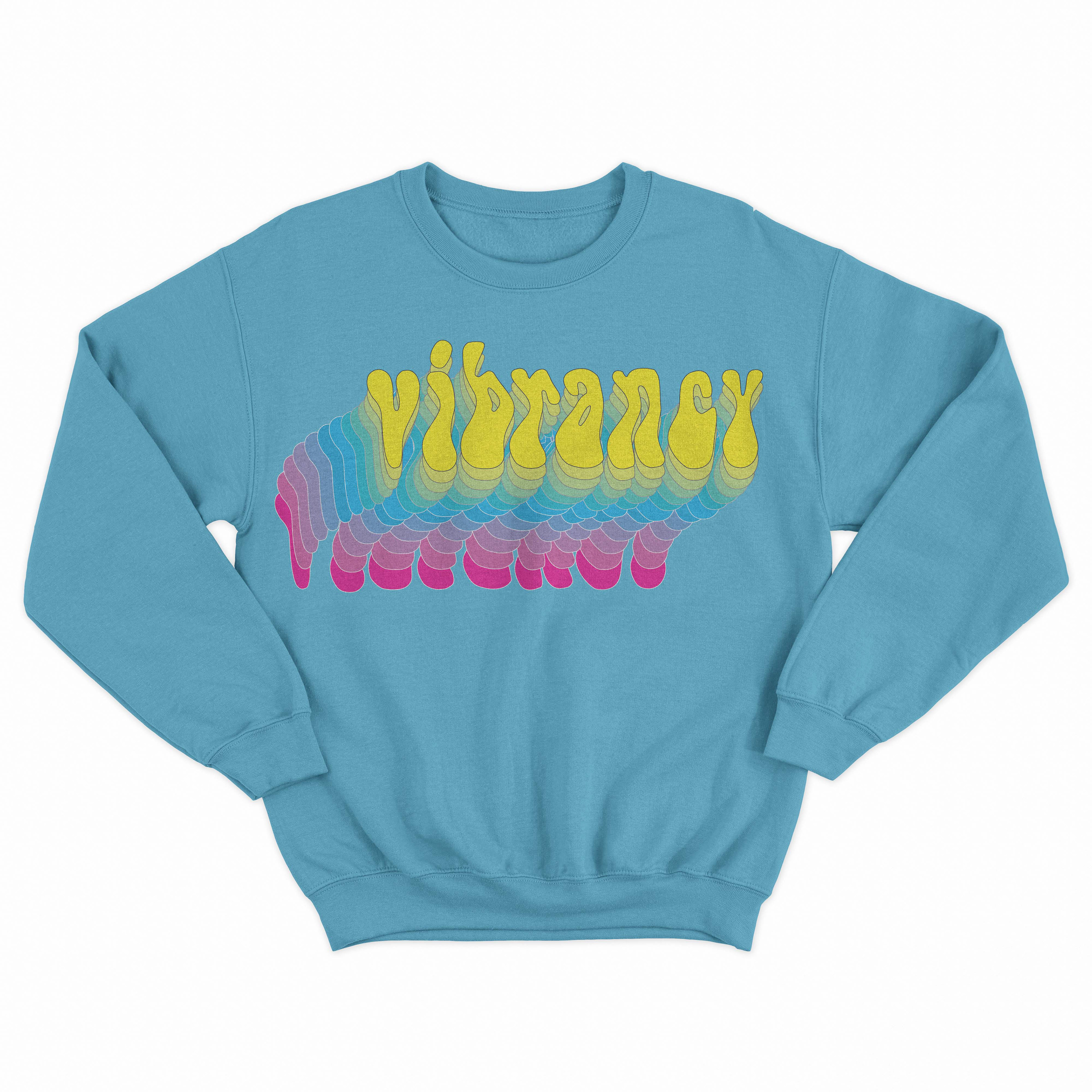
Vibrancy is a fictitious brand that sells playing cards and various merchandise. The entire brand was created in 16 weeks and included creating: a logo, all 55 poker cards digital and printed, packaging, shipping packaging, t-shirt design, sweatshirt designs, a bucket hat, website mockups, skateboard design, 5 poster designs, and a final process book.
Featured in the 2022 Cal Poly Pomona 2D3D+ student art exhibition.
Winner of the Visual Communication Design Honorable Mention Award.
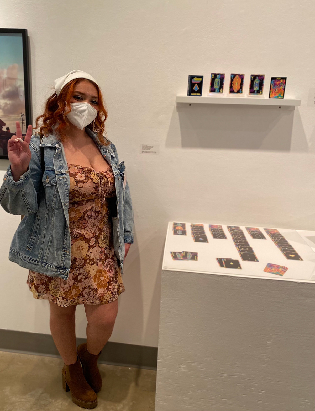
This is me next to my deck of cards on display at the W. Keith and Janet Kellogg University Art Gallery on the night they were given the Honorable Mention Award in the Design Category.
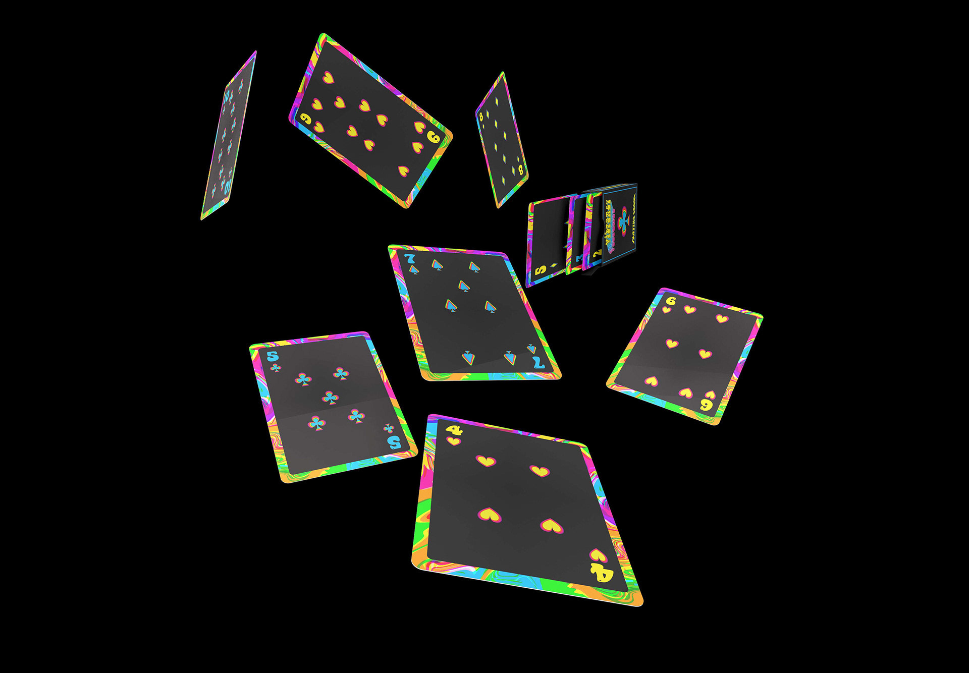
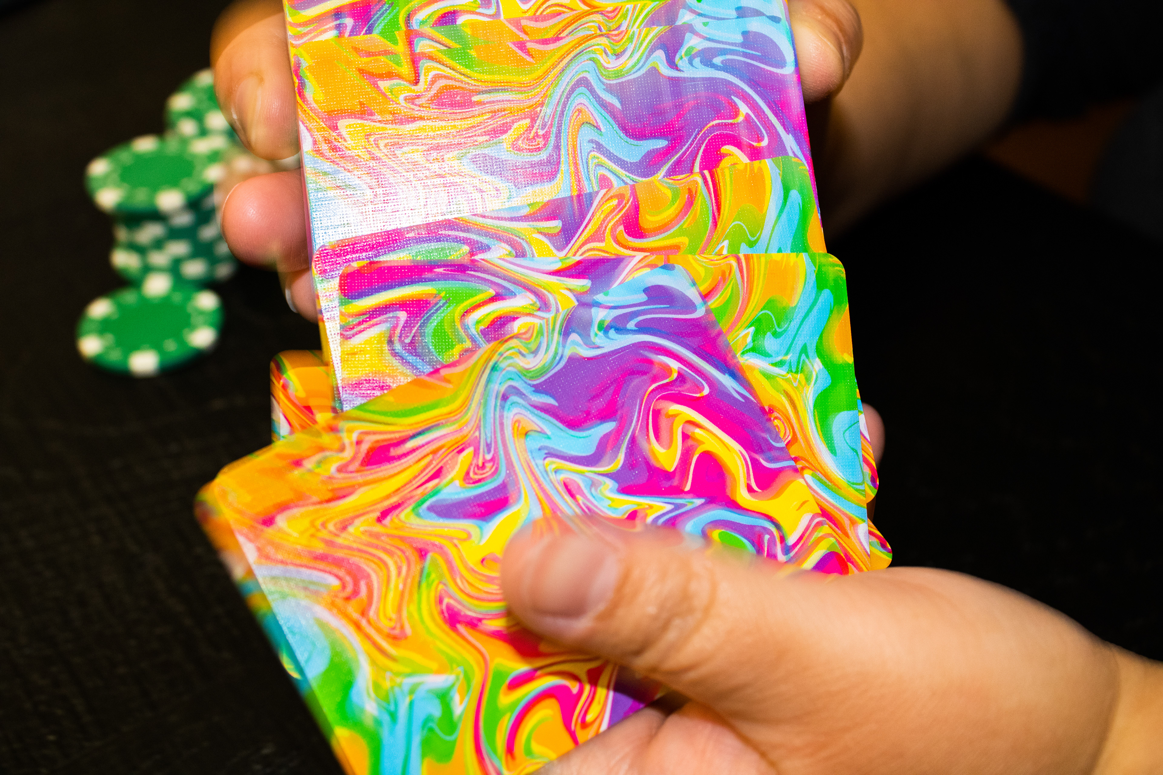
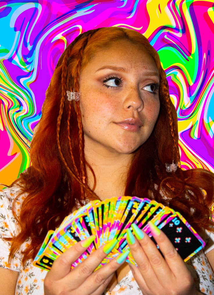
Dynamic image of the deck of cards.
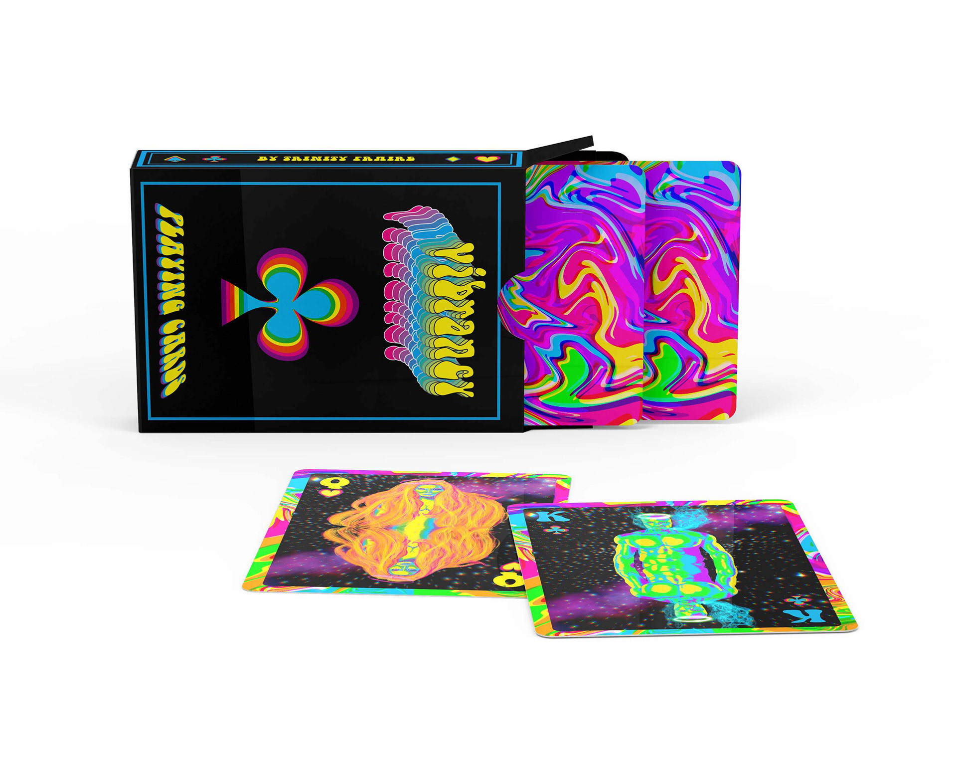
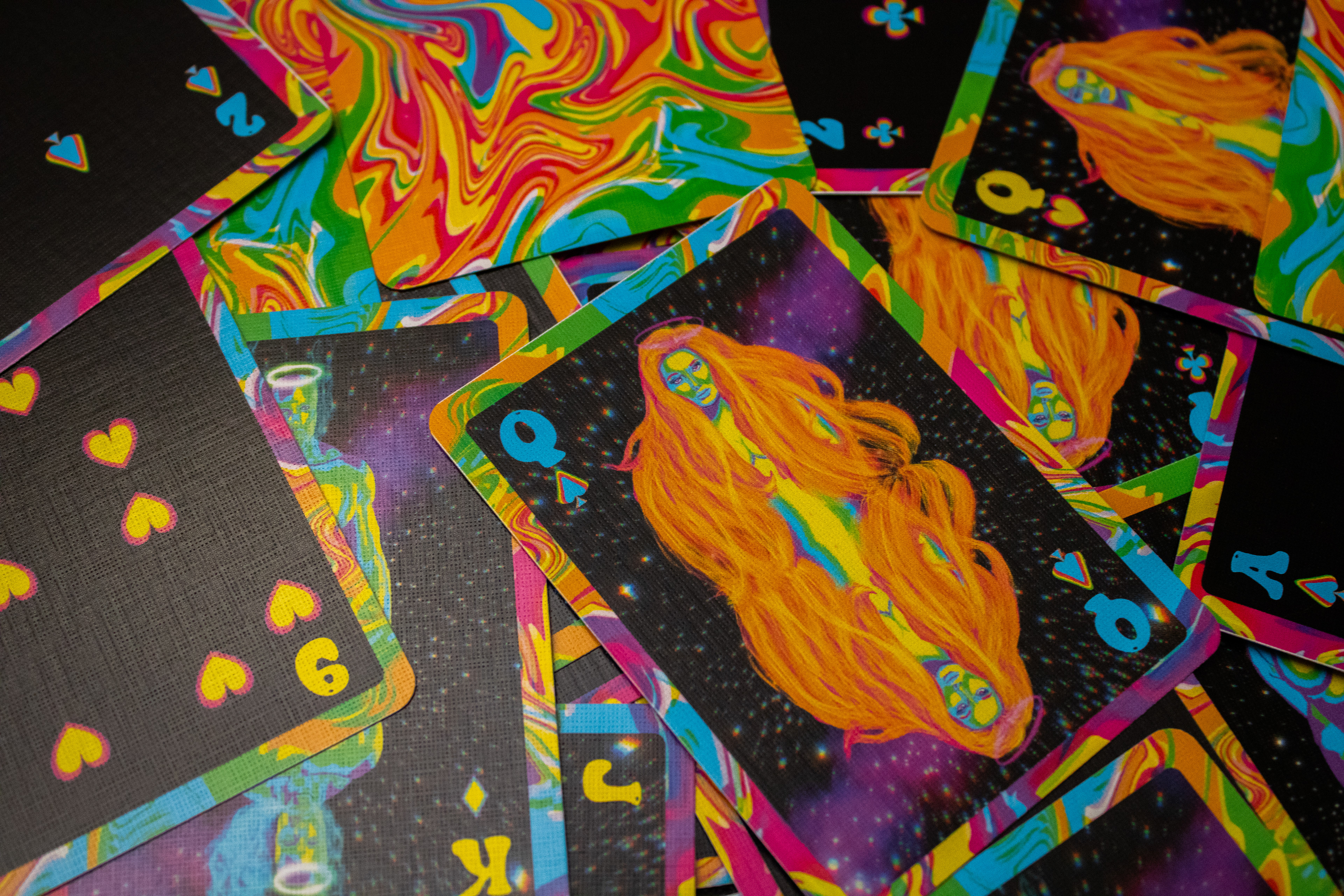
Close up of the King and Queen Cards
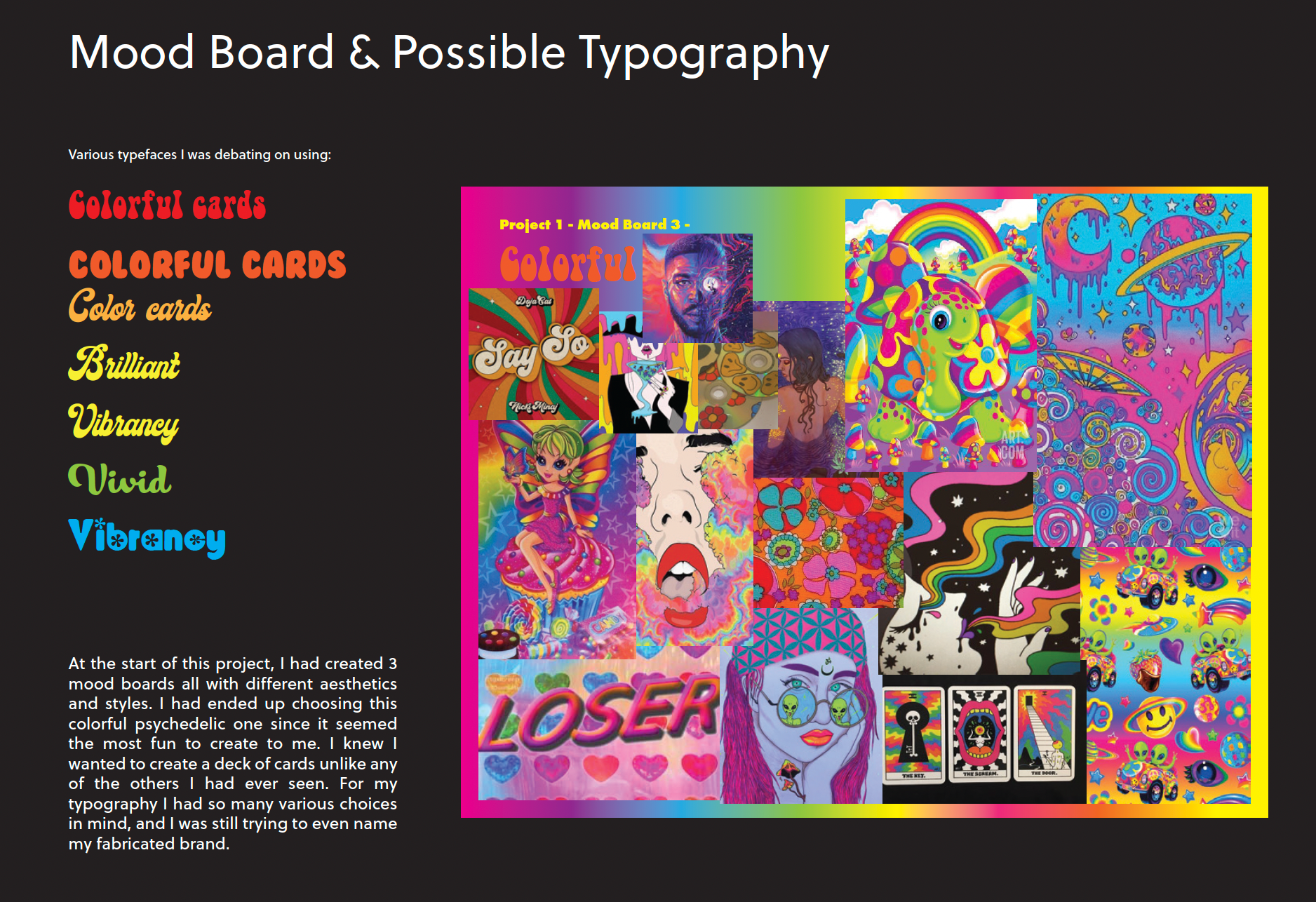
Initial Concept & Inspiration
Logo Design
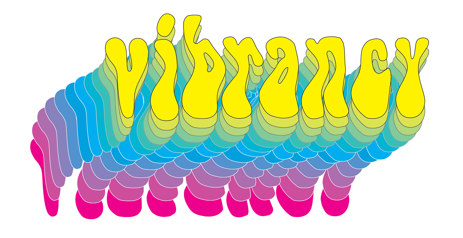
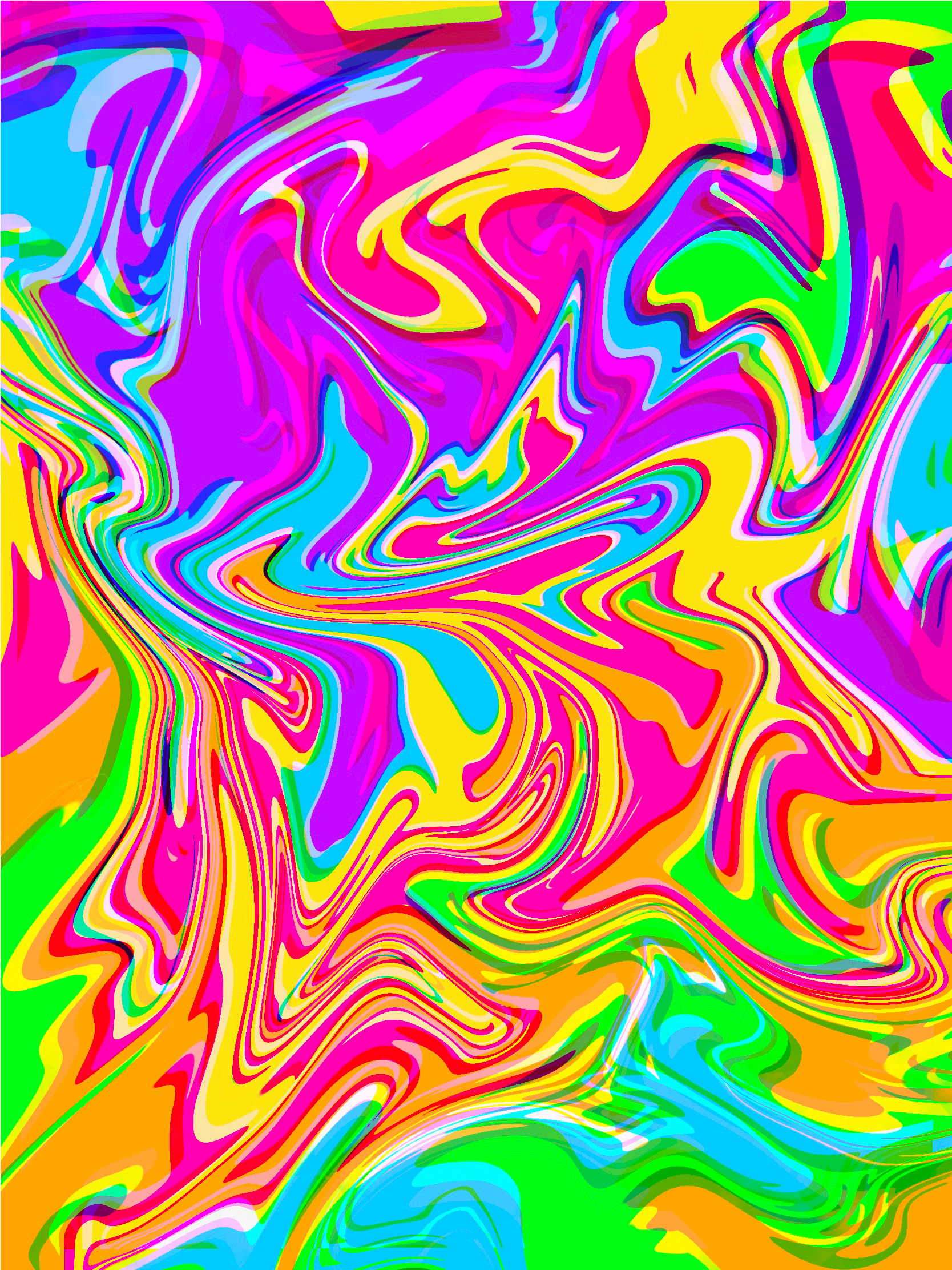
The logo for Vibrancy needed to have something eye-catching and use bright colors. On trend of the psychedelic movement, the logo is very busy and playful.
Playing Cards Development
When I started designing the cards, I wanted to capture the fun and colorful aesthetic. However, I was determined to find a more mature way to have colorful cards.
Final Card Design
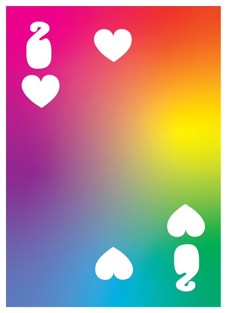
Back of all cards.
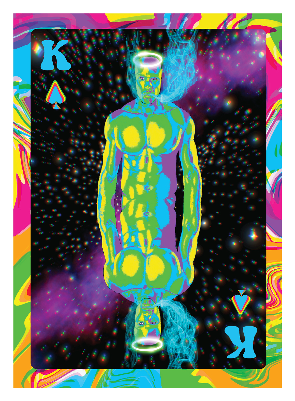
King of spades card.
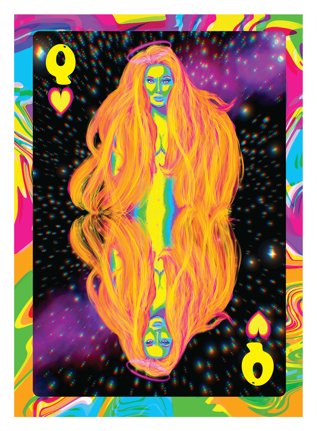
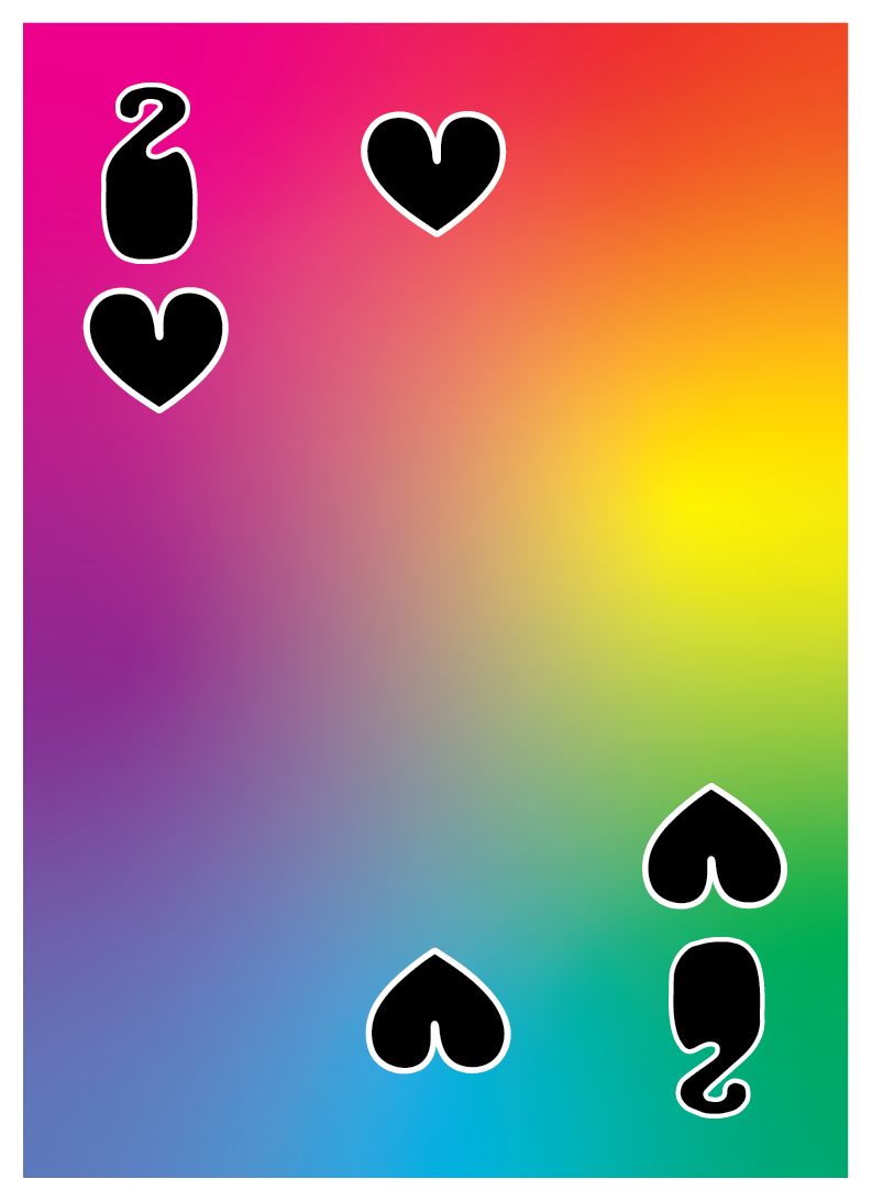
Queen of hearts card.
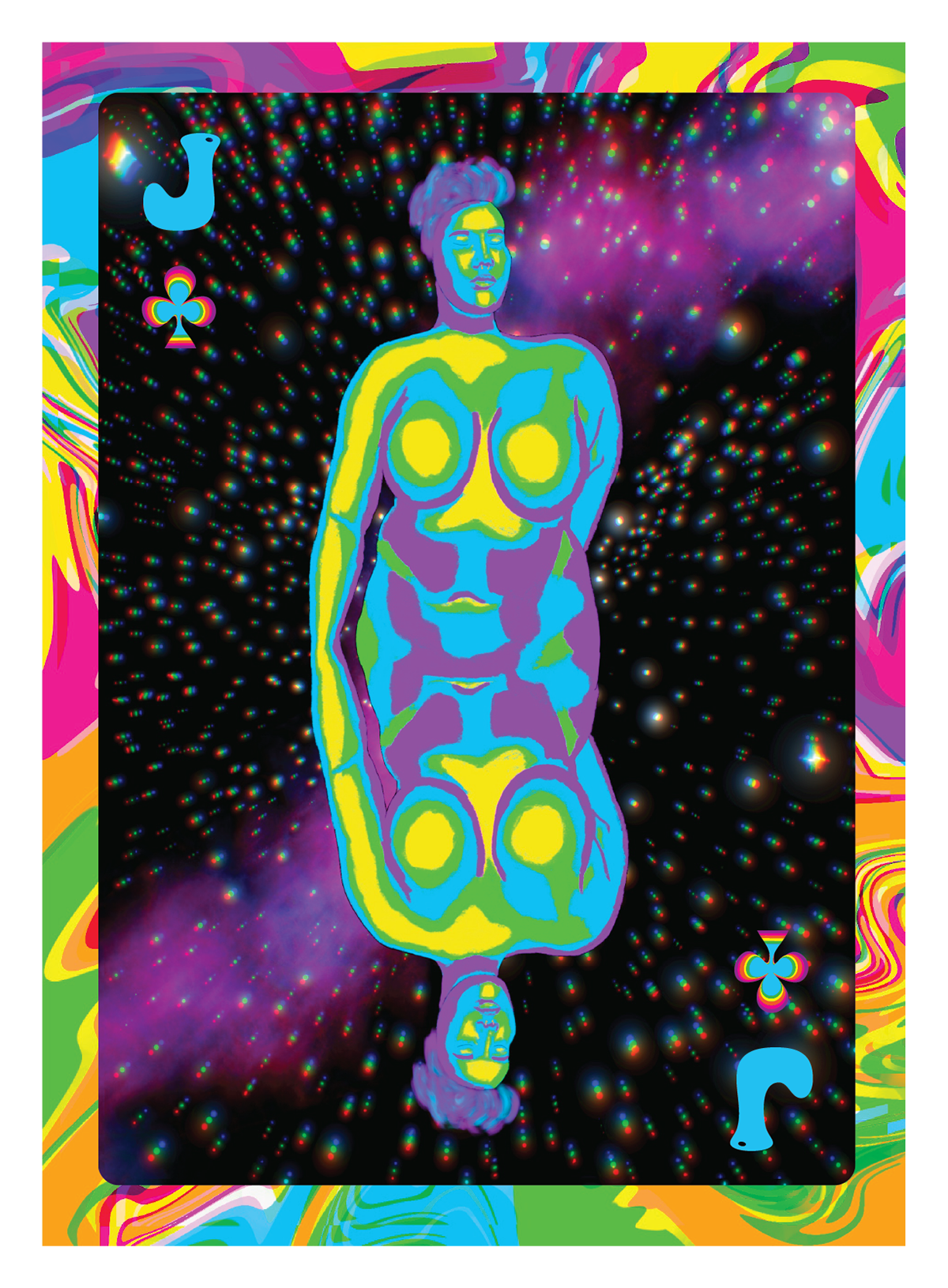
Jack of clubs card.
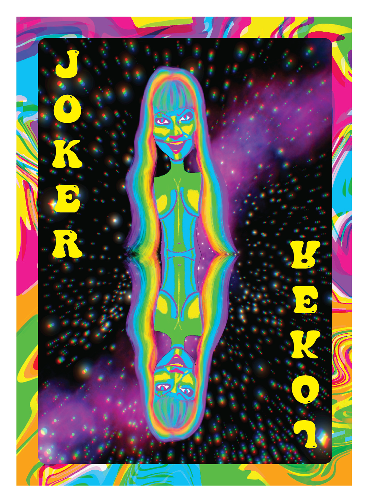
Joker card.
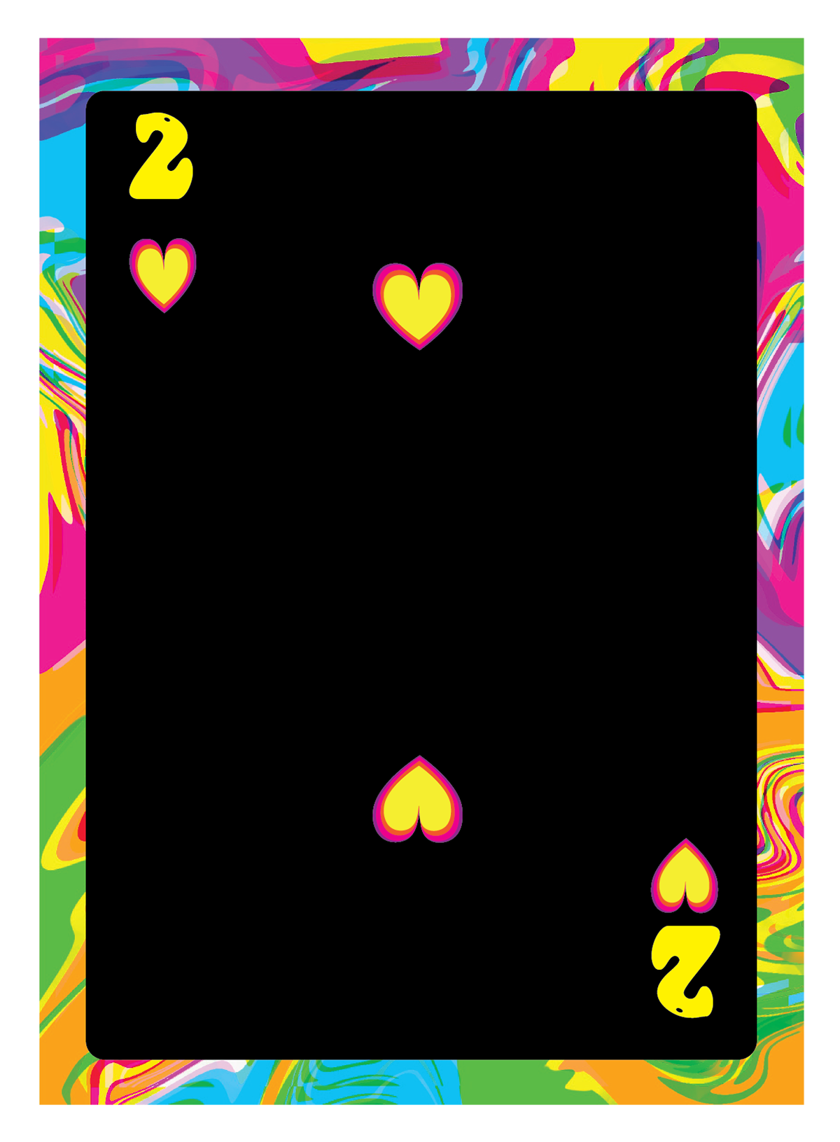
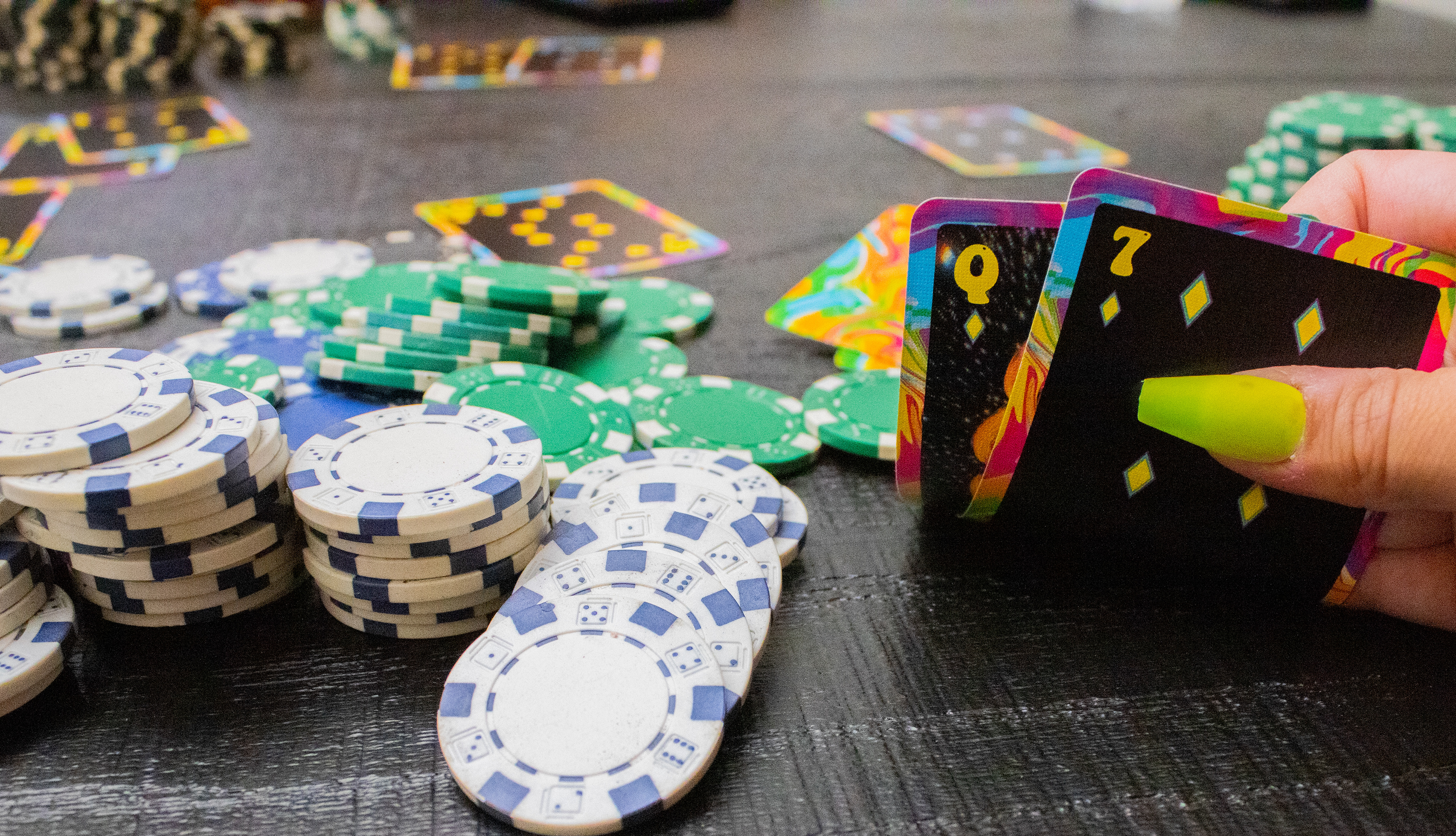
Example of the number cards.
After some time and feedback from others, I developed the final card designs. I wanted to use a fun colorful mess for the back of all the cards. I drew each of the face cards on Procreate and decided that a space background would help push the psychedelic vibe. I decided on this typeface because it was the right amount of groovy and legible.
Printed Cards Photography
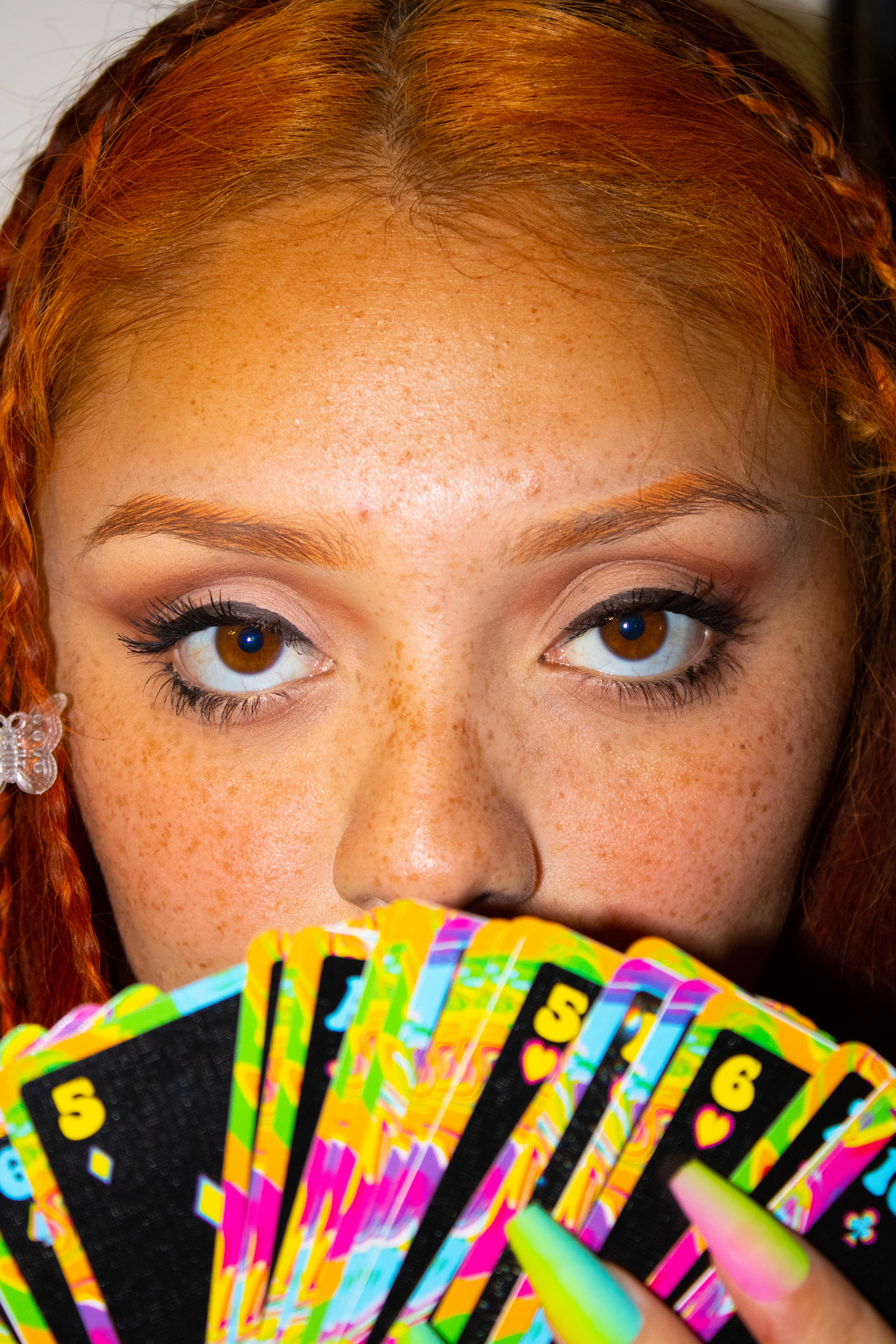
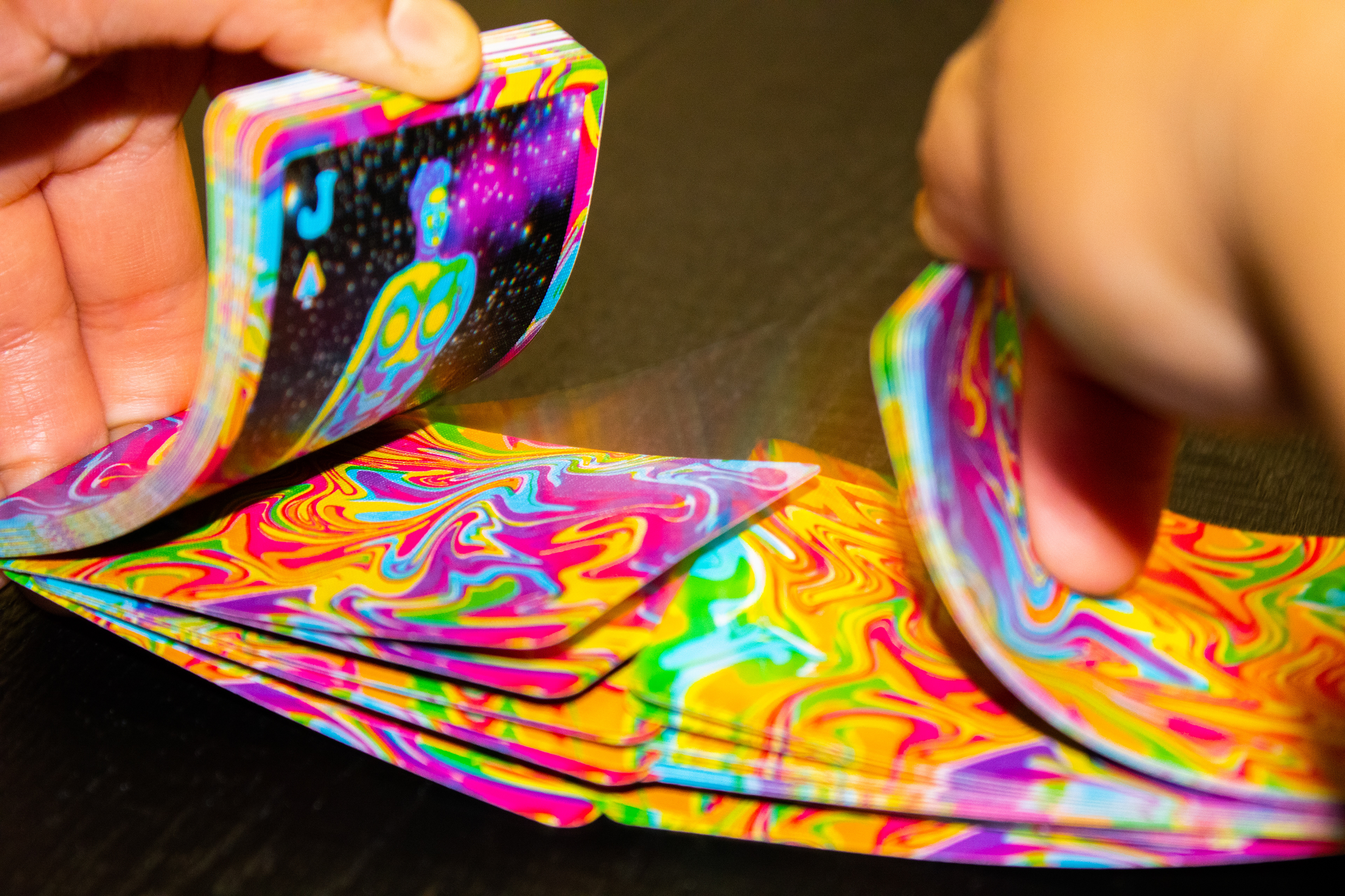
After I sent all of my playing cards to get printed on high-quality linen, I was able to photograph my cards along and even got to play with them since they were printed on playing card material.
Packaging Design
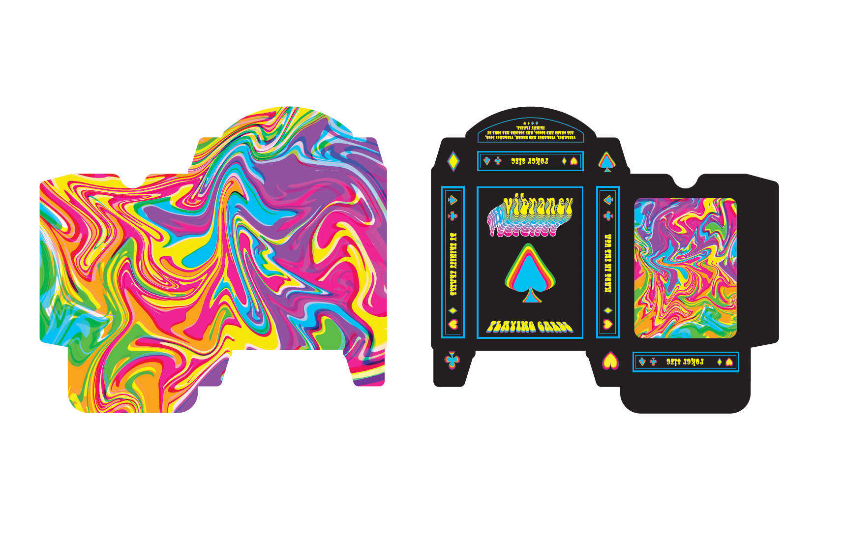
On the left is the inside of the card box. To the right is the outside packaging. It was challenging to create a die cut for a small box with lots of small folds. I made sure to include the logo and an example of the back of the cards on the packaging. Having the pop of crazy colors on the inside is a nice surprise.
Other Branding Materials

Black crewneck with suits details.
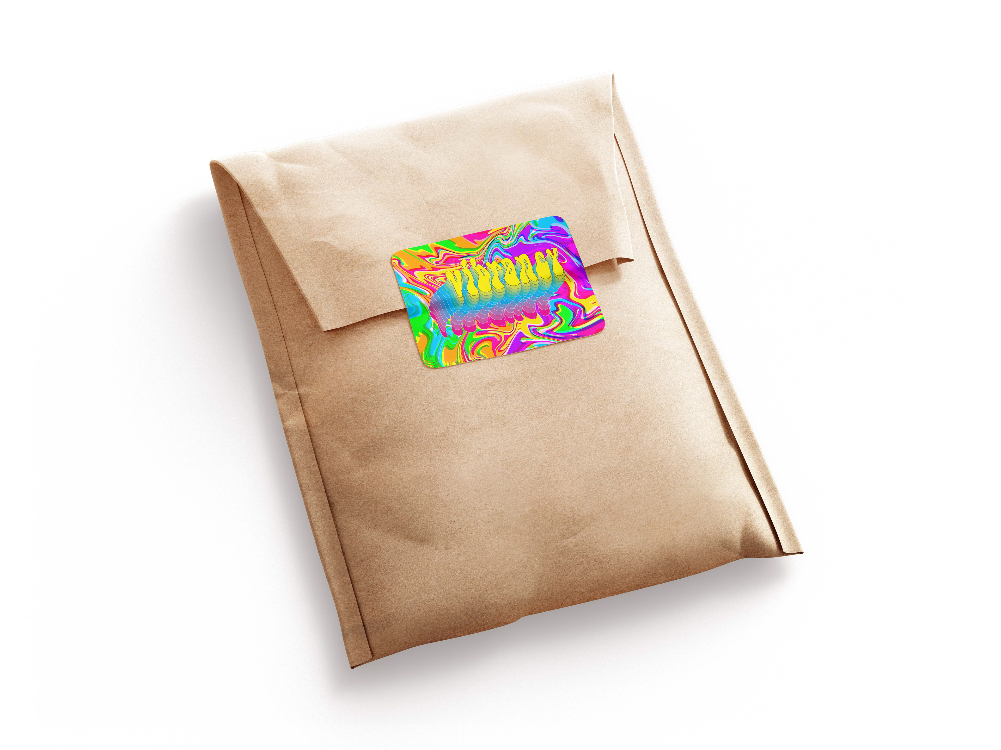
Shipping packaging for the deck of cards.
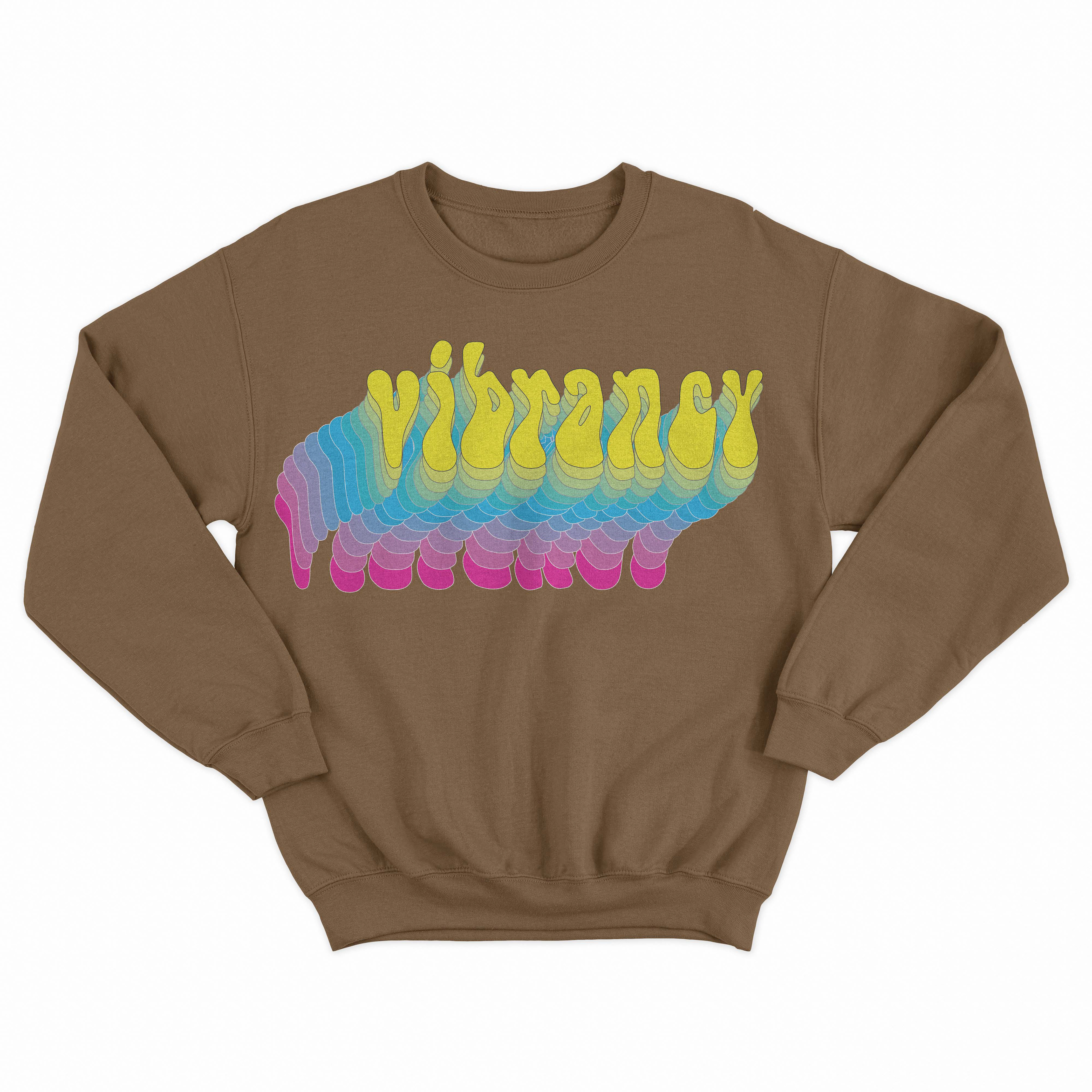
Brown crewneck.
Baby Blue crewneck.
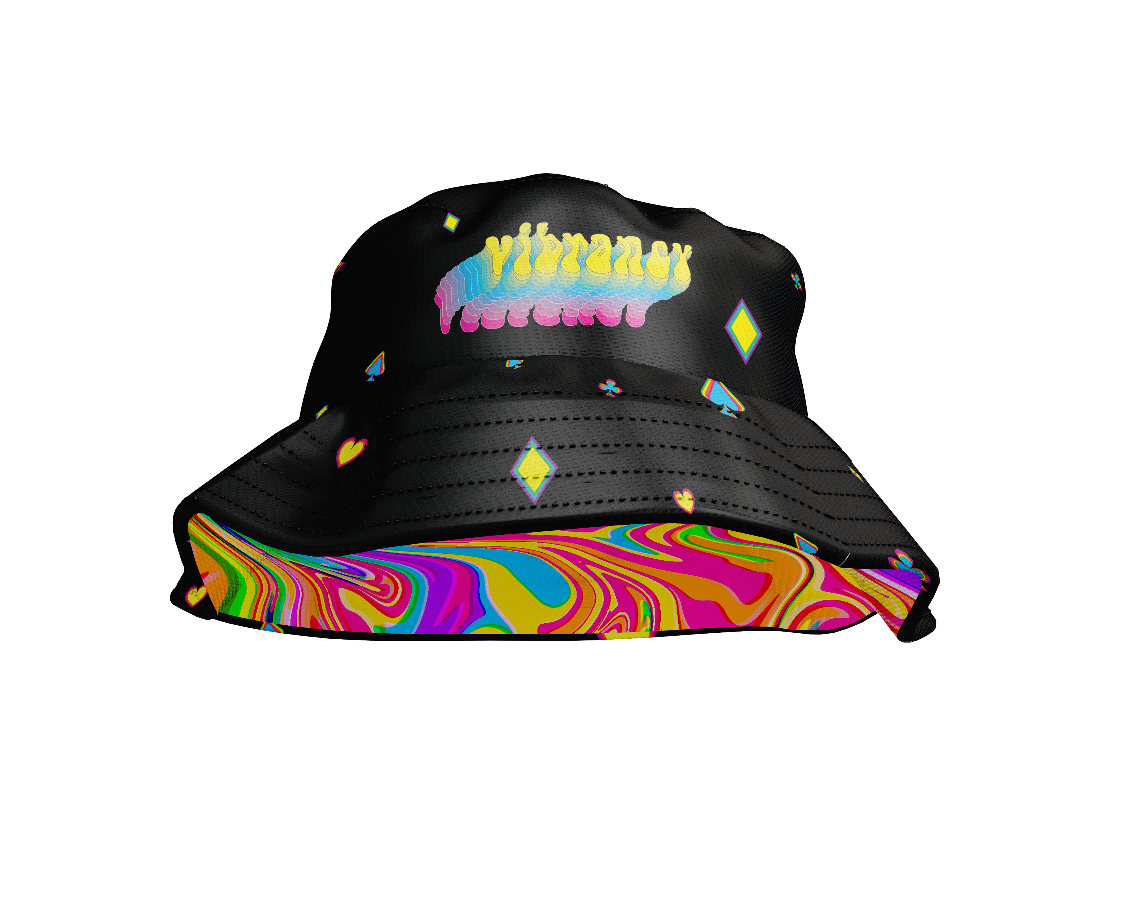
Black bucket hat with colorful details.
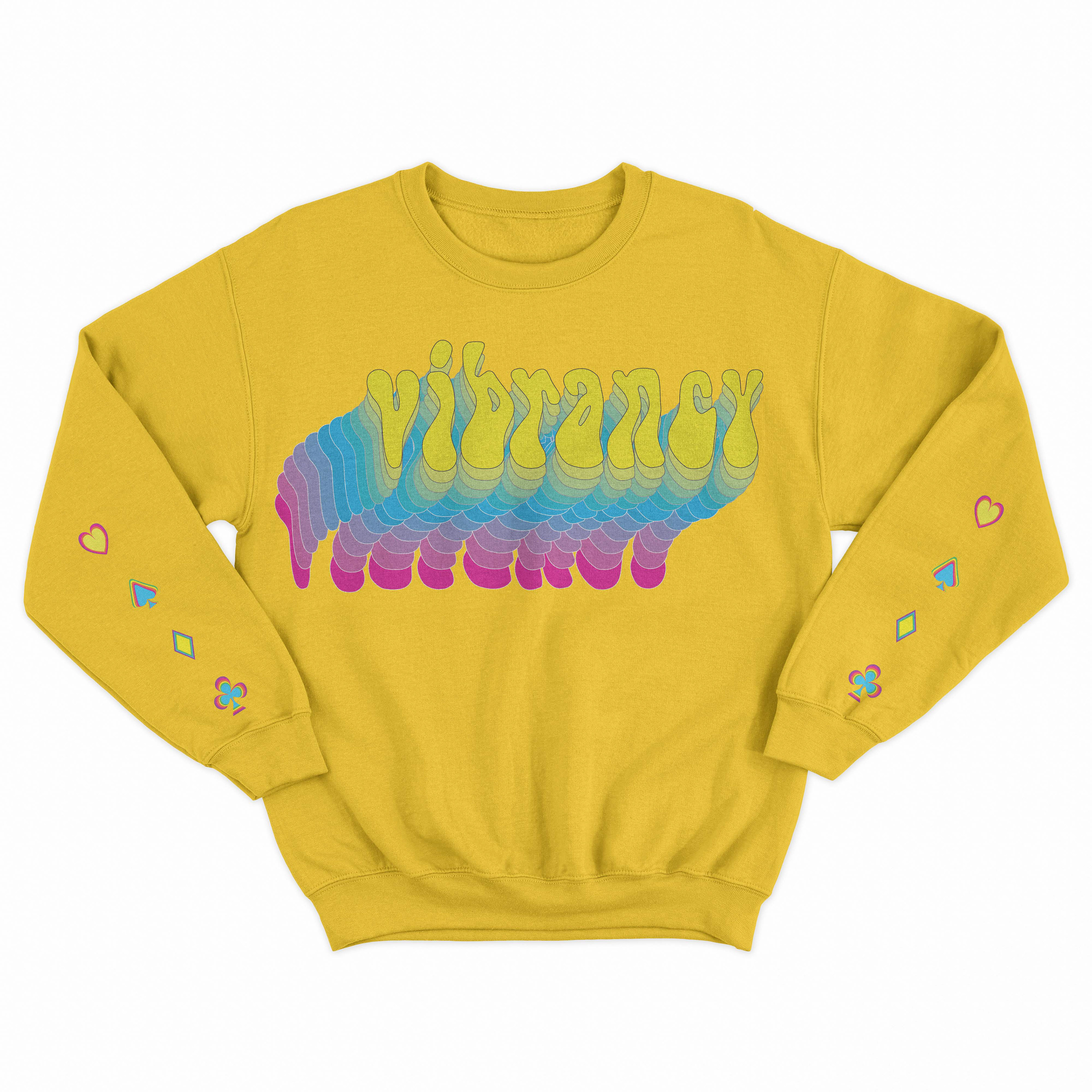
Yellow crewneck with suits details.
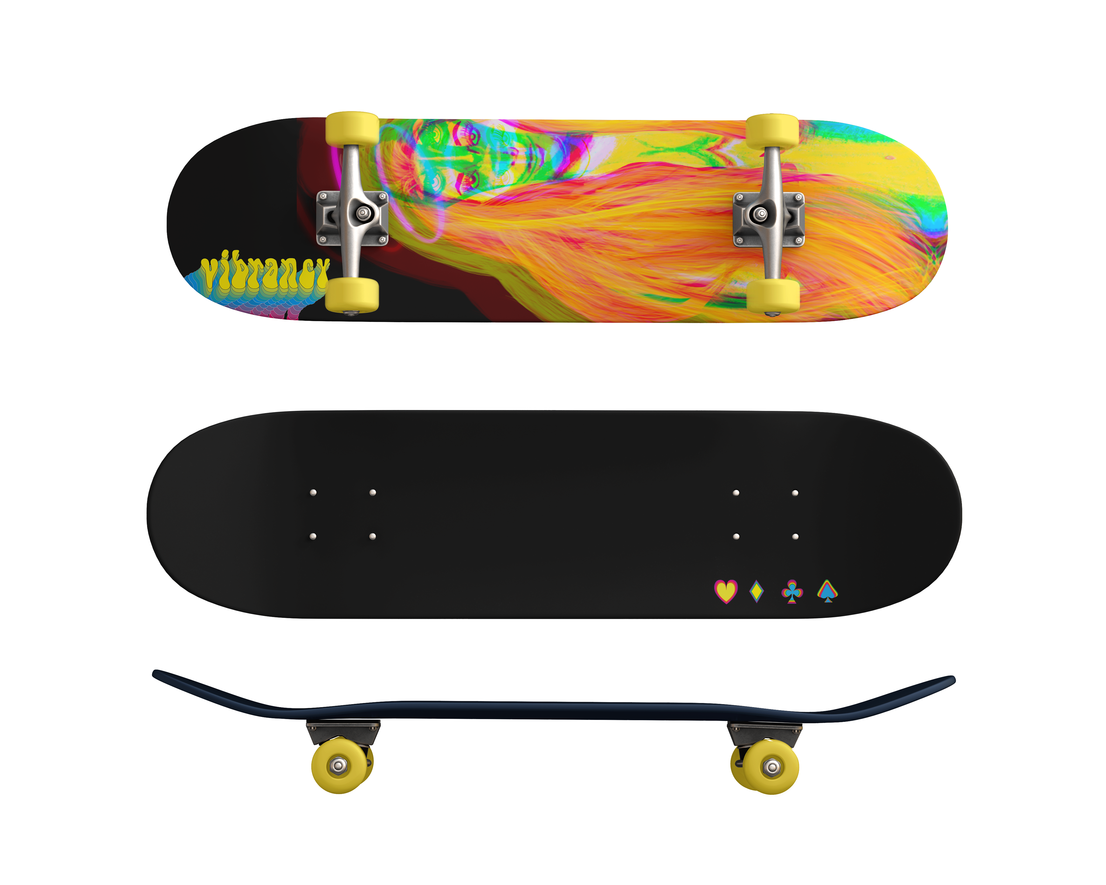
Skateboard design.
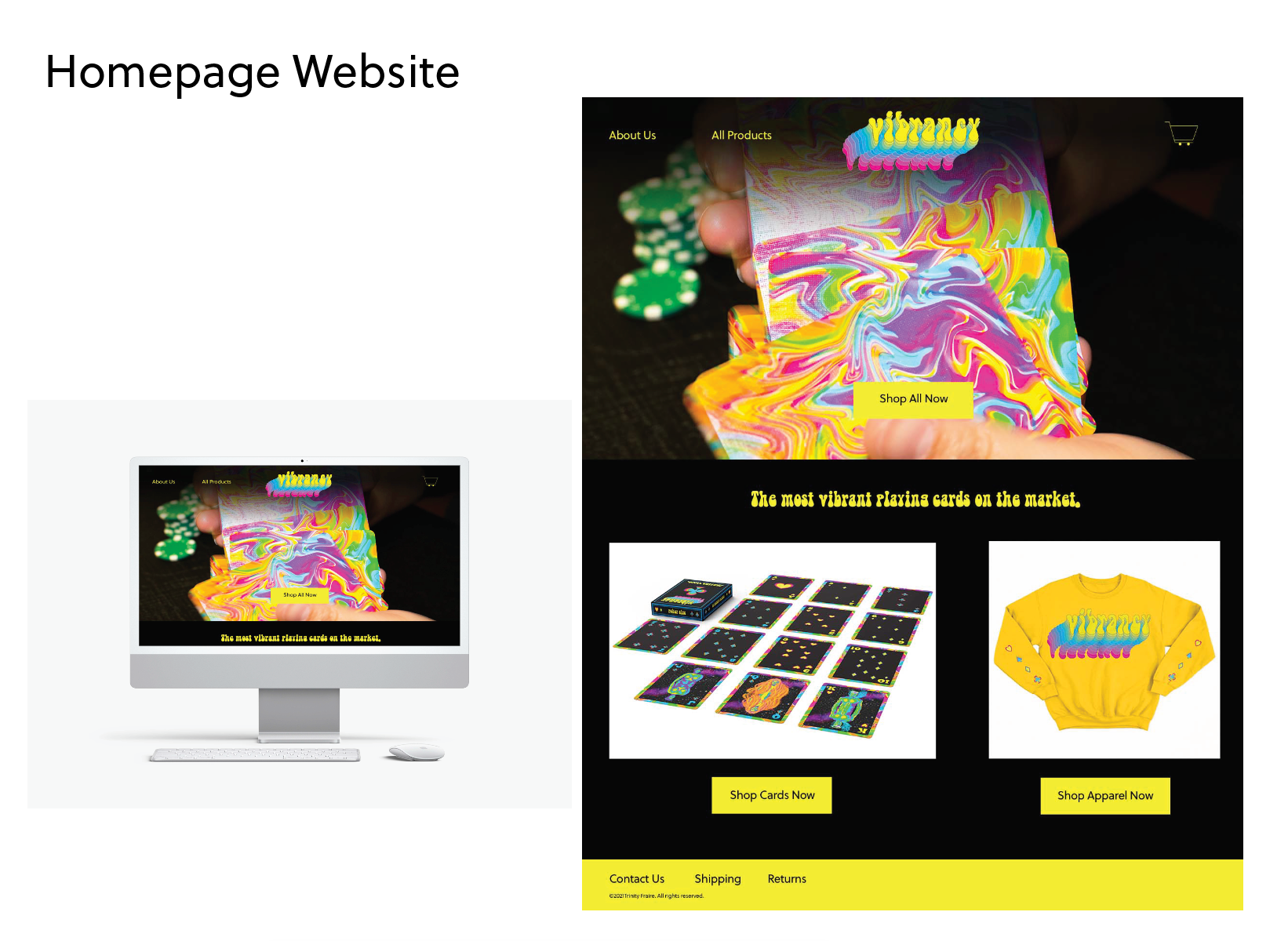
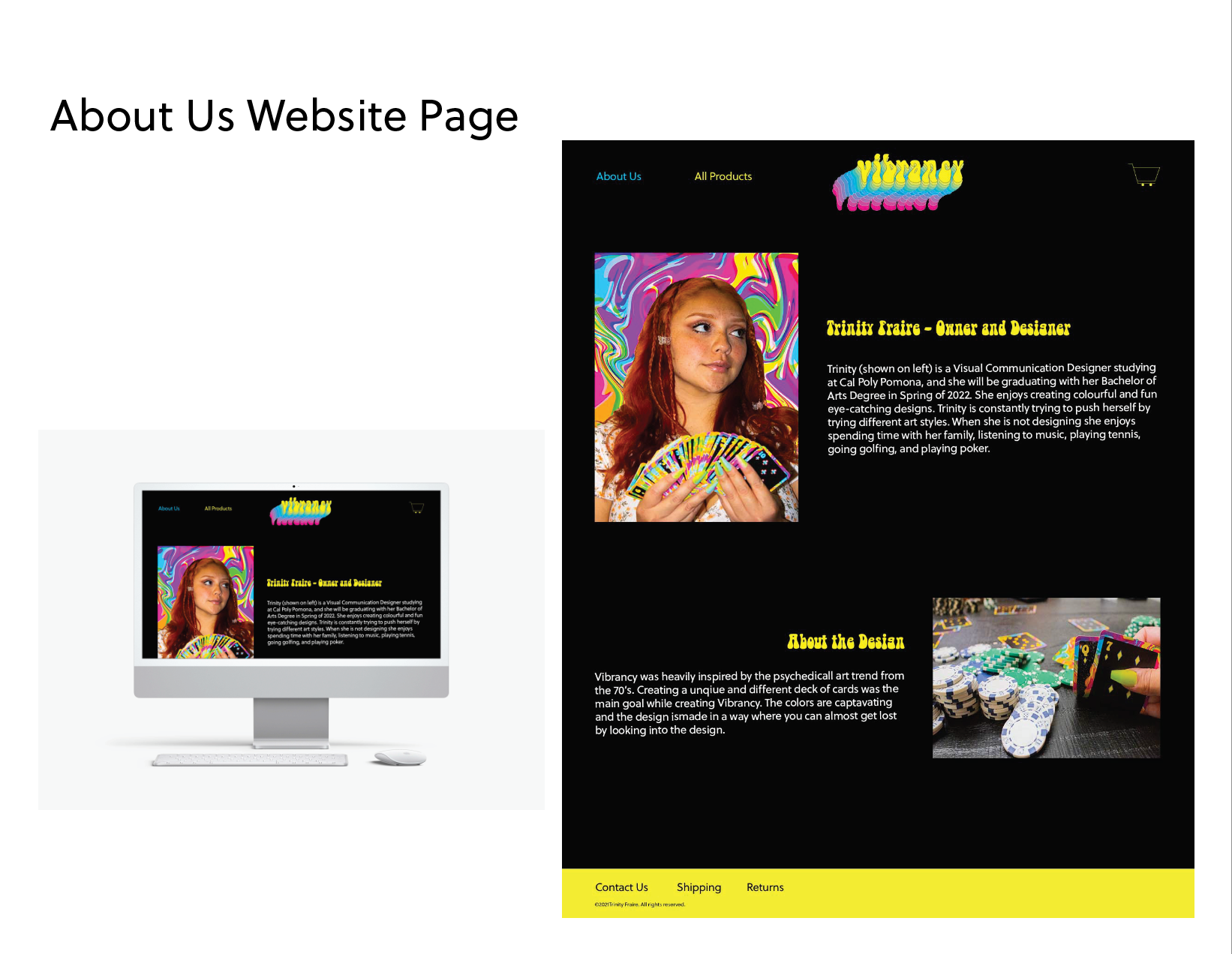
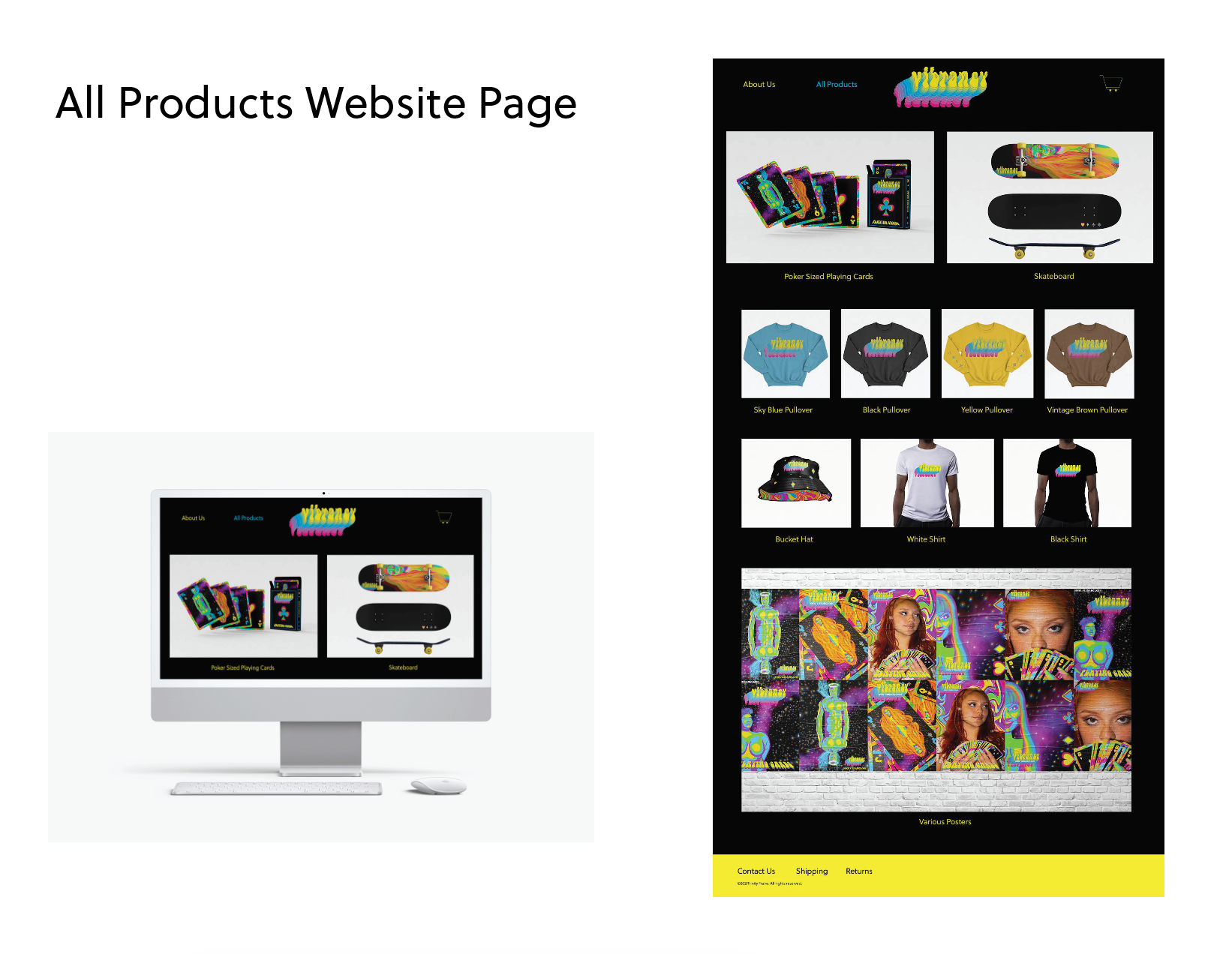
Website Design