
Clients:
Craig Walters: AGRIscapes Director
Margie Jones: interim dean of Collins College of Hospitality Management
Holly Greene: Equine Lecturer & Compliance and Safety Specialist
Description:
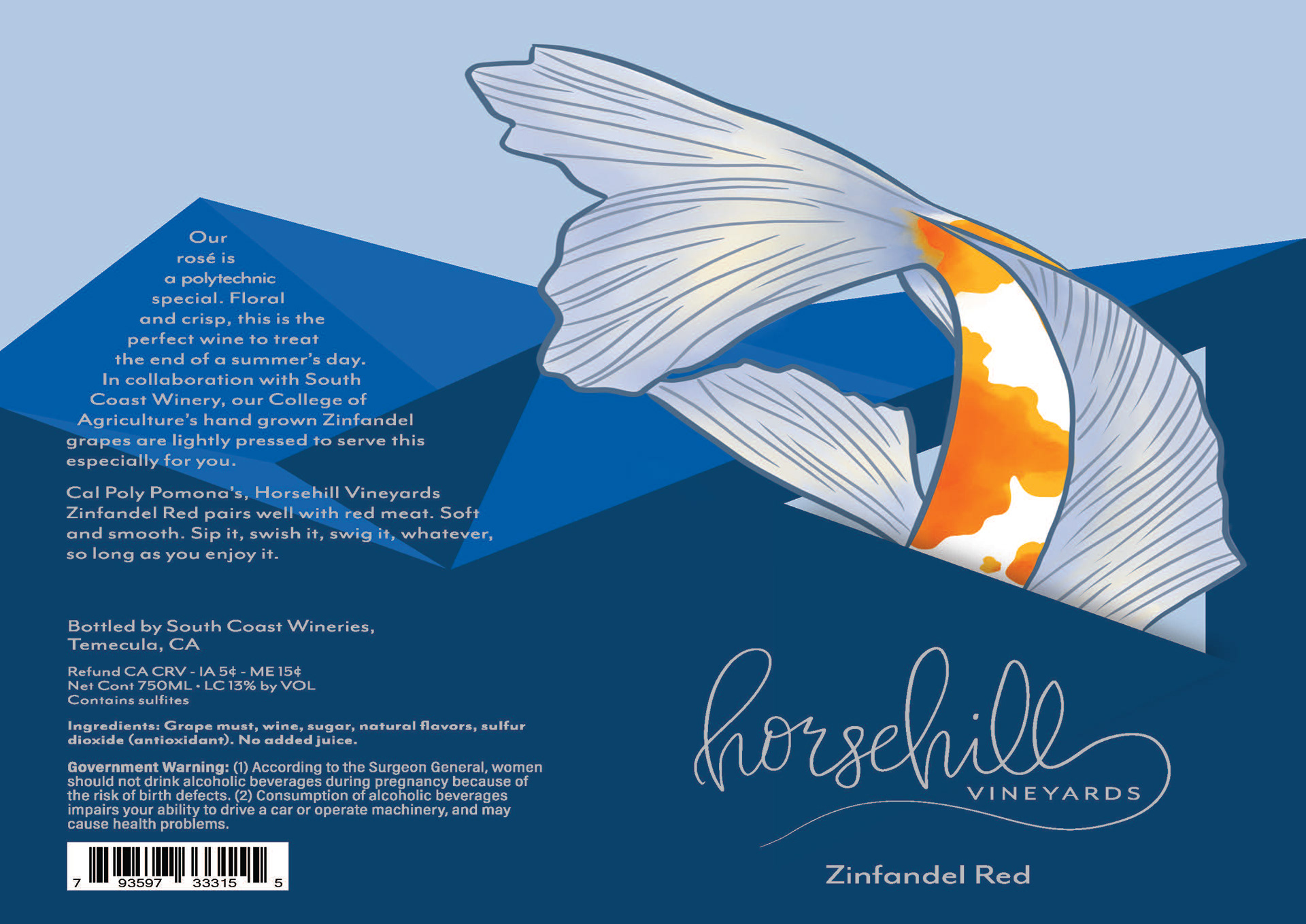
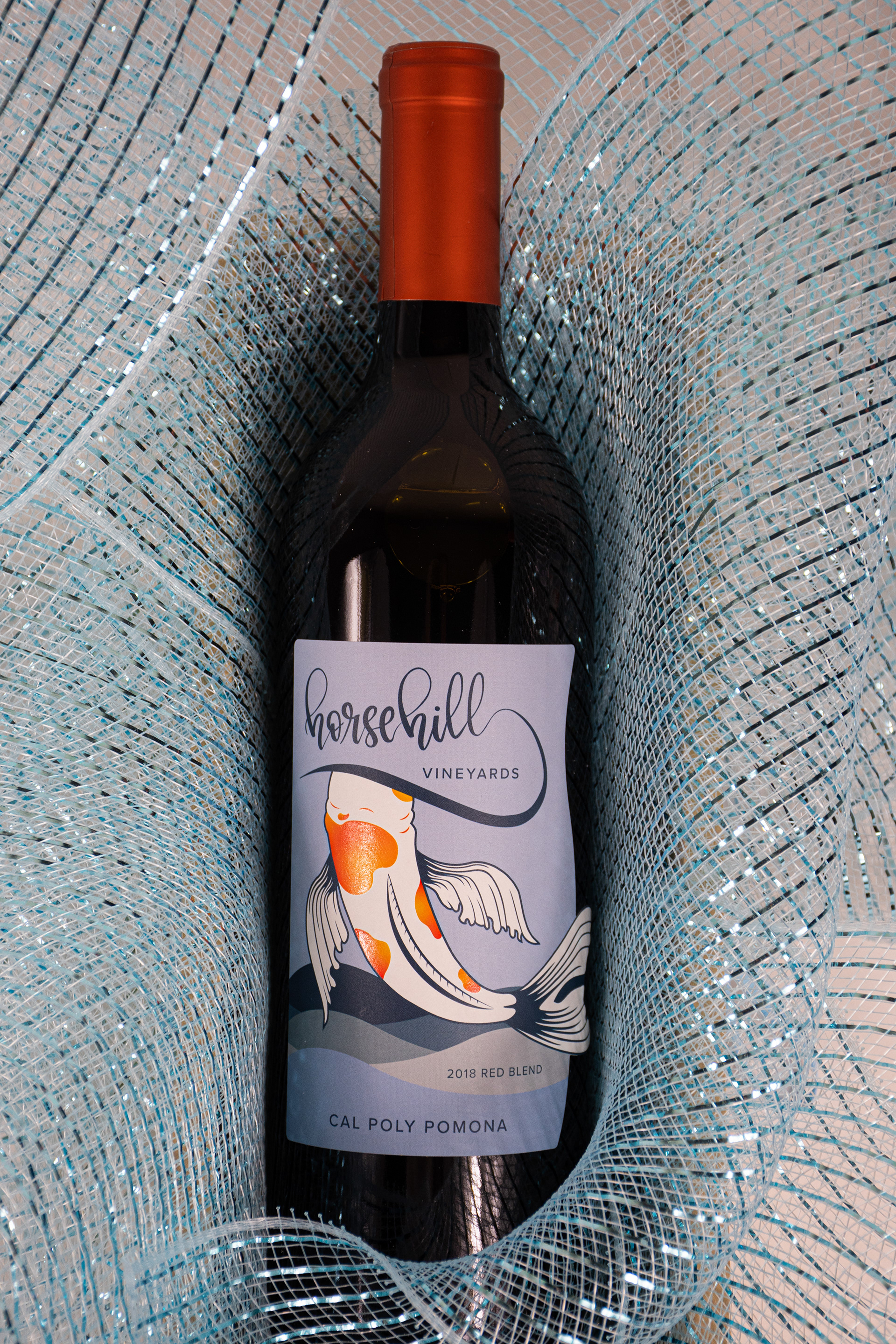
In 2018 the Horsehill Vineyards' production of their red blend was suddenly halted due to the Covid-19 pandemic. Because of this, when the project was rebooted in 2022, the Horsehill Vineyards team was in need of an updated design. Tyler J. Hughey and myself were approached by Design Team Lead Sarah A. Meyer to rectify the issues. The original design was completed by: Rachel Wong, Rachel Stelzer, Emma Wahlstrom, and Julia Batterson.
Starting Point
When the group came to Tyler and I with the original design, they had several areas of concern that they wanted us to rectify: To avoid using the dark blue color to provide more contrast with the previous year's bottle. Eliminating the design motif of the CLA building since it has now been torn down. Improve the legibility of the content on both the front and back labels. And lastly, provide a label that doesn't utilize a full wrap around the wine bottle.
Hand Lettering Process Work
executed by: Trinity
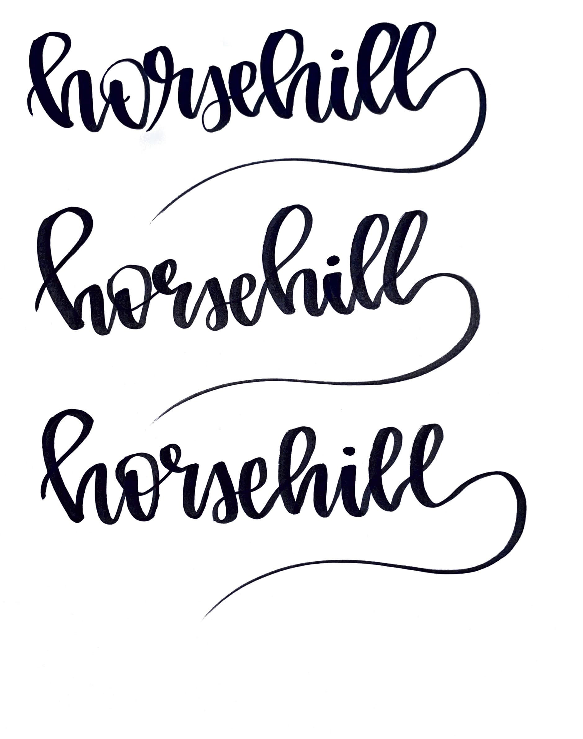
Hand lettering on paper.
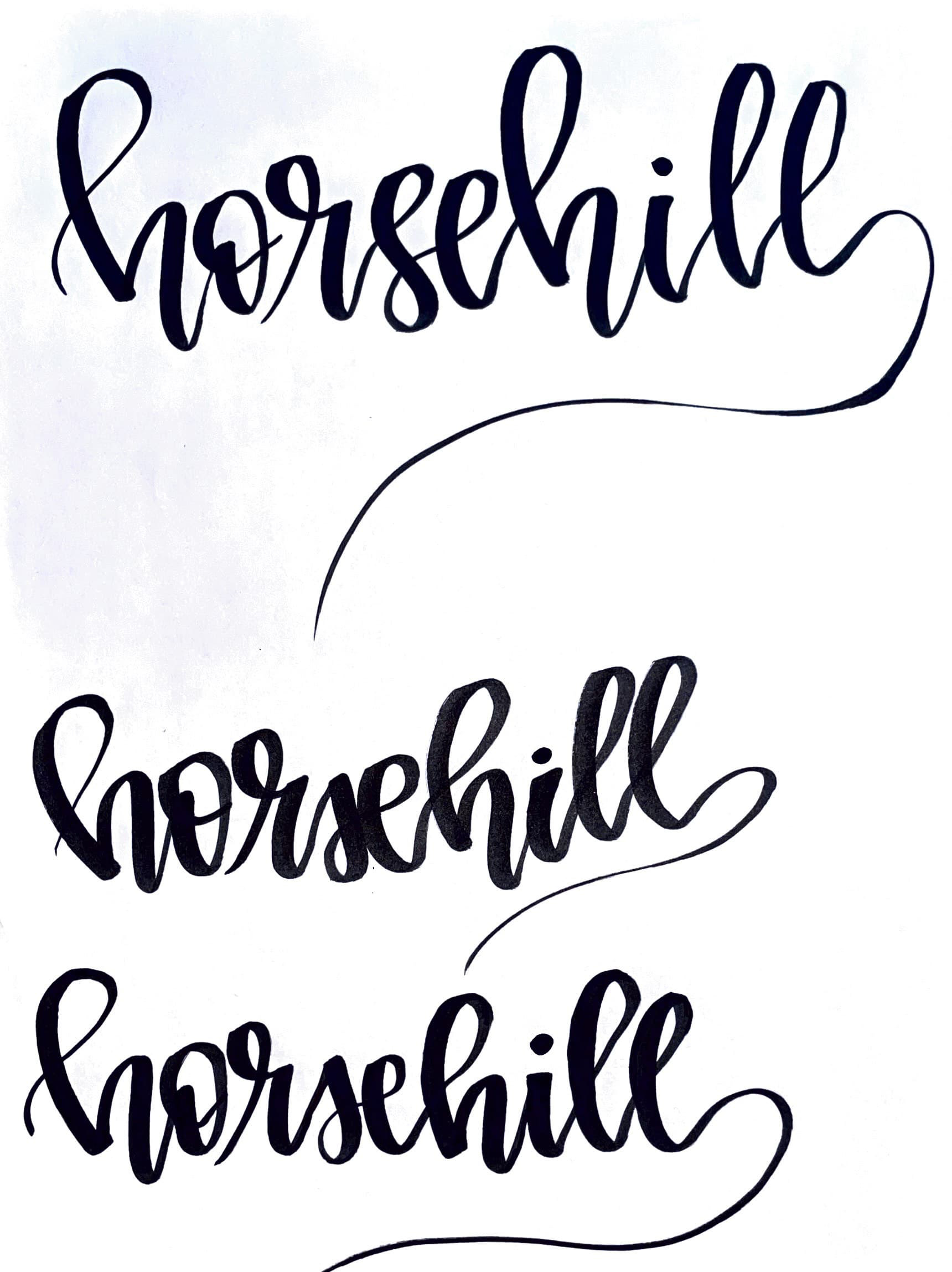
Hand lettering on paper.
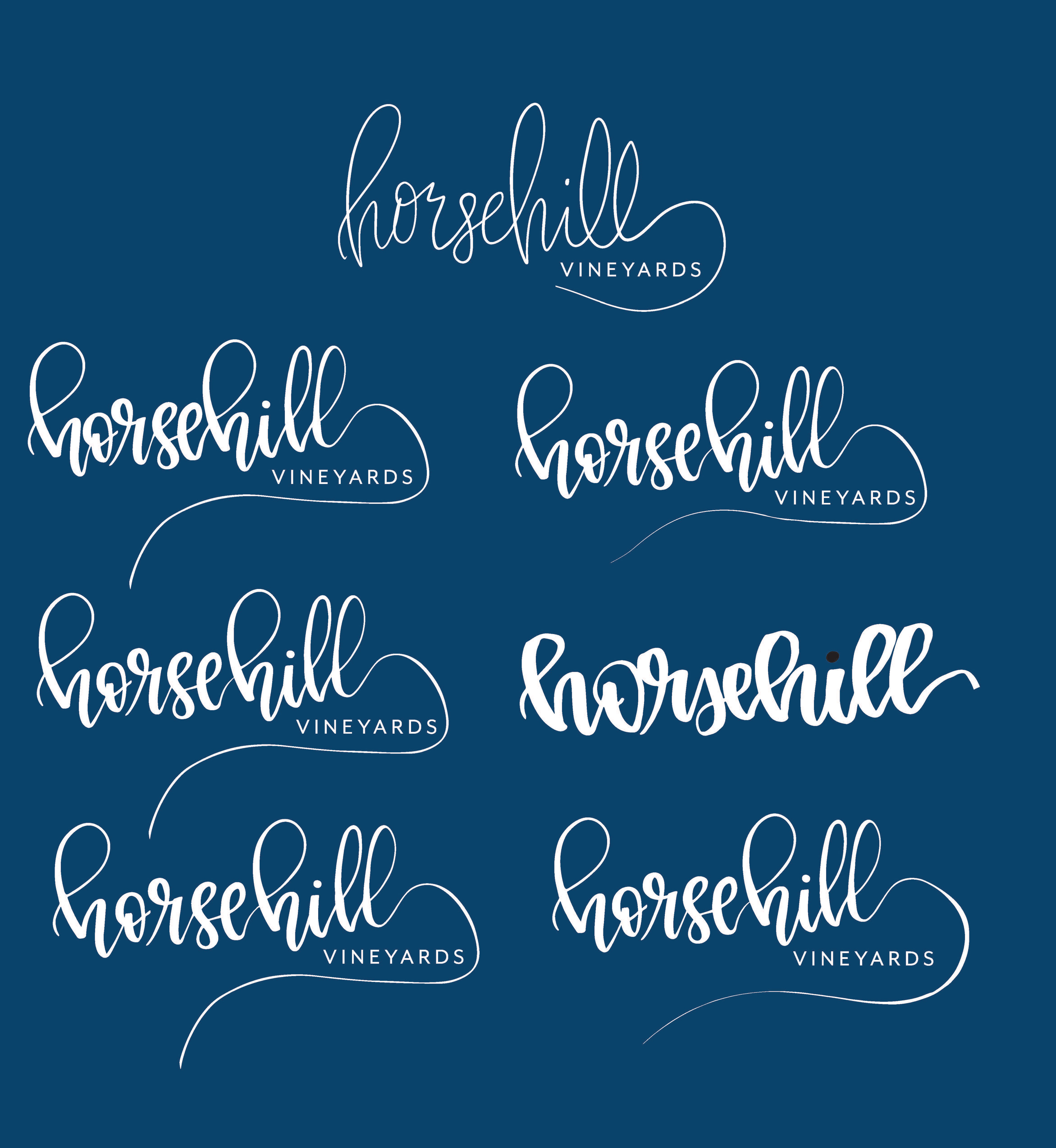
Digitization of my hand lettering.
Orignal hand lettering.
My hand lettering.
The original hand lettering felt very light and playful. It had an elegance to it while still being able to have movement simultaneously.
The current version of the hand lettering improved readability by having contrast in the thicks and thins. With this, the label could be seen and read at a greater distance. It still has the same bubbly and bouncing feeling that the original captivated.
To achieve this I first wrote out "Horsehill" countless times on paper using pen. Then scanned it to clean it up by digitalizing it.
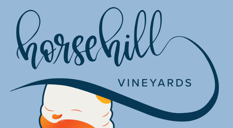
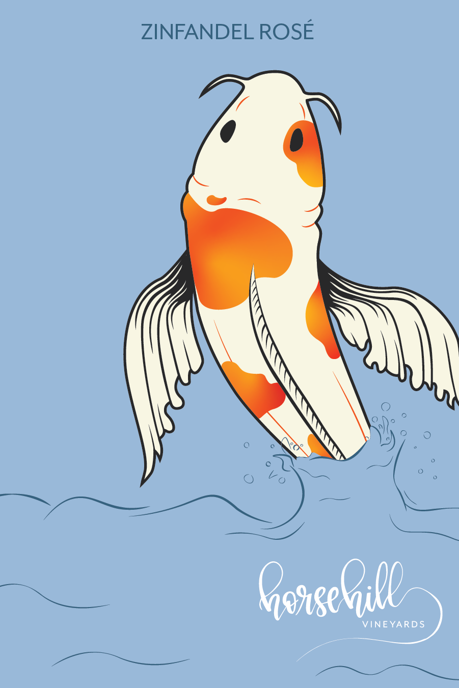
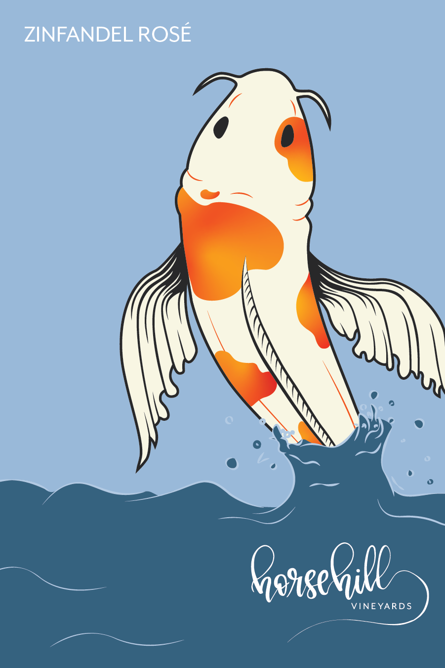
Koi Fish Process Work
executed by: Tyler
Tyler took the responsibility of redesigning the koi fish illustration. Tyler and I agreed that the label would be stronger with the fish swimming upstream since the original team stated that 'swimming downstream' represents the challenges faced during the pandemic. We both agreed that swimming upstream to represent overcoming difficulties would be better suited.


Initial Concept
Once Tyler was done redesigning the fish, and I was done re-doing the hand lettering we worked on creating a new composition.
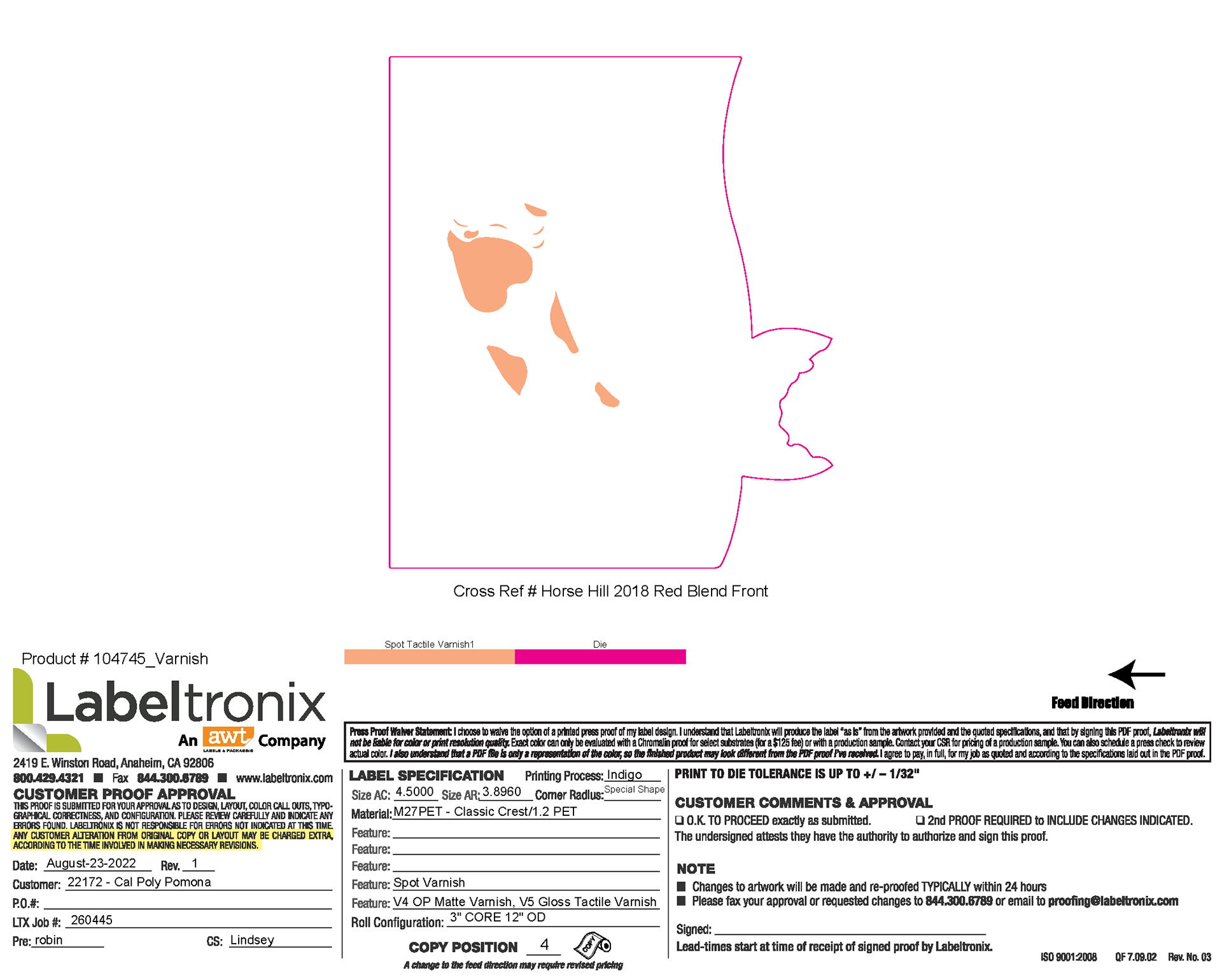
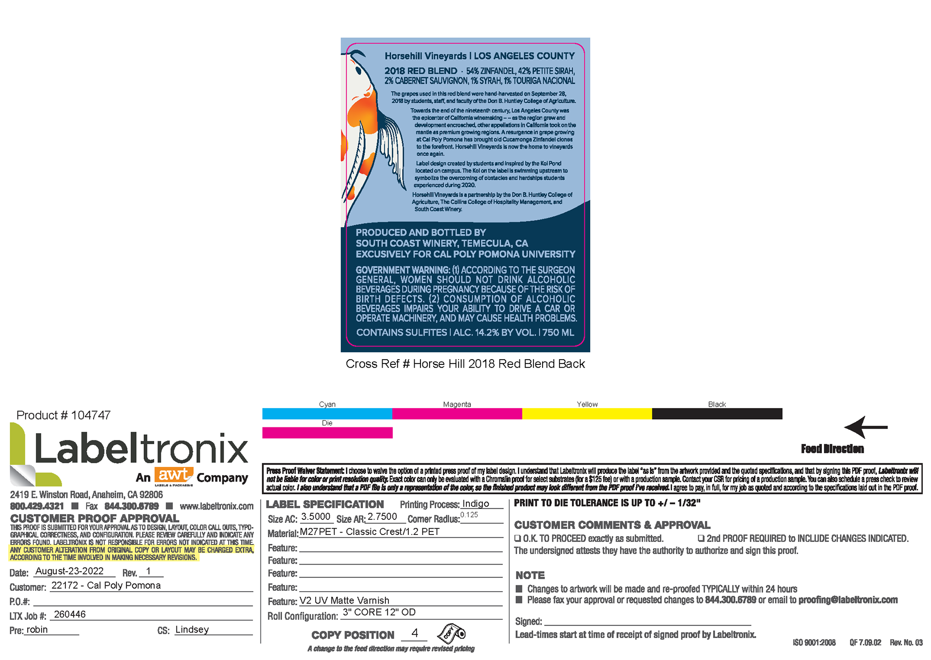
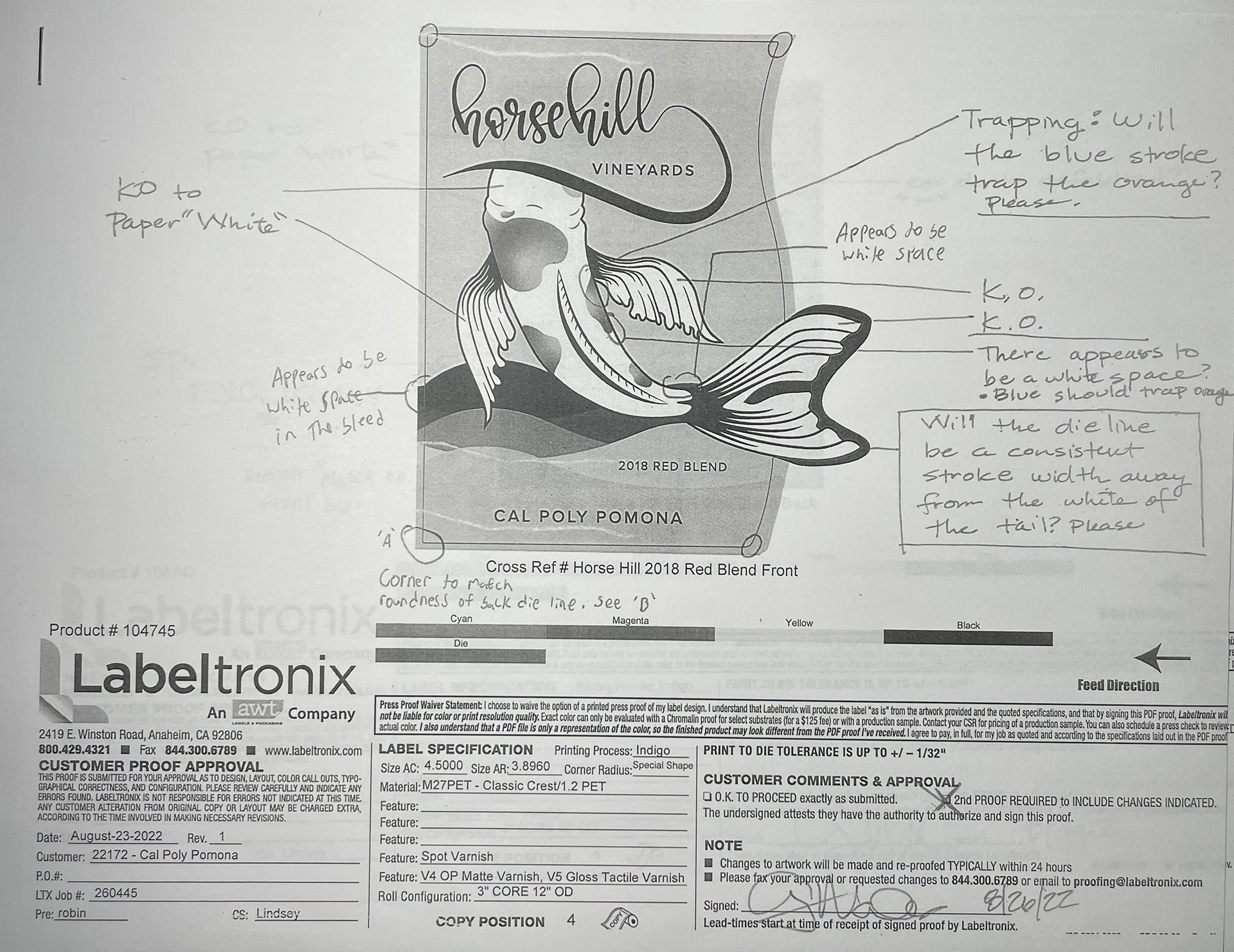
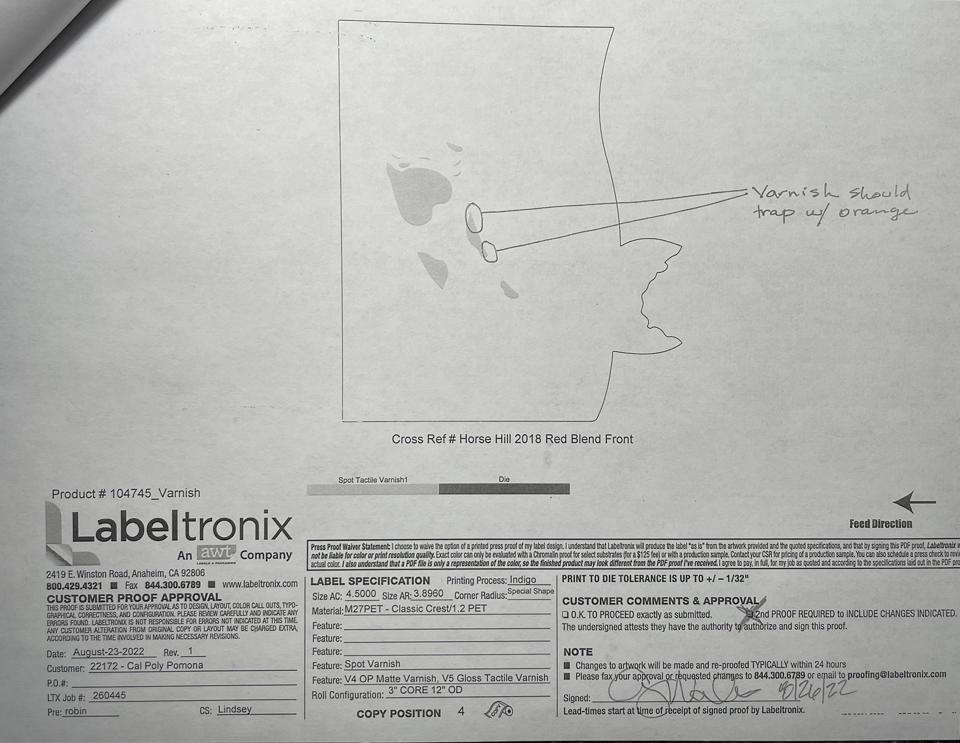
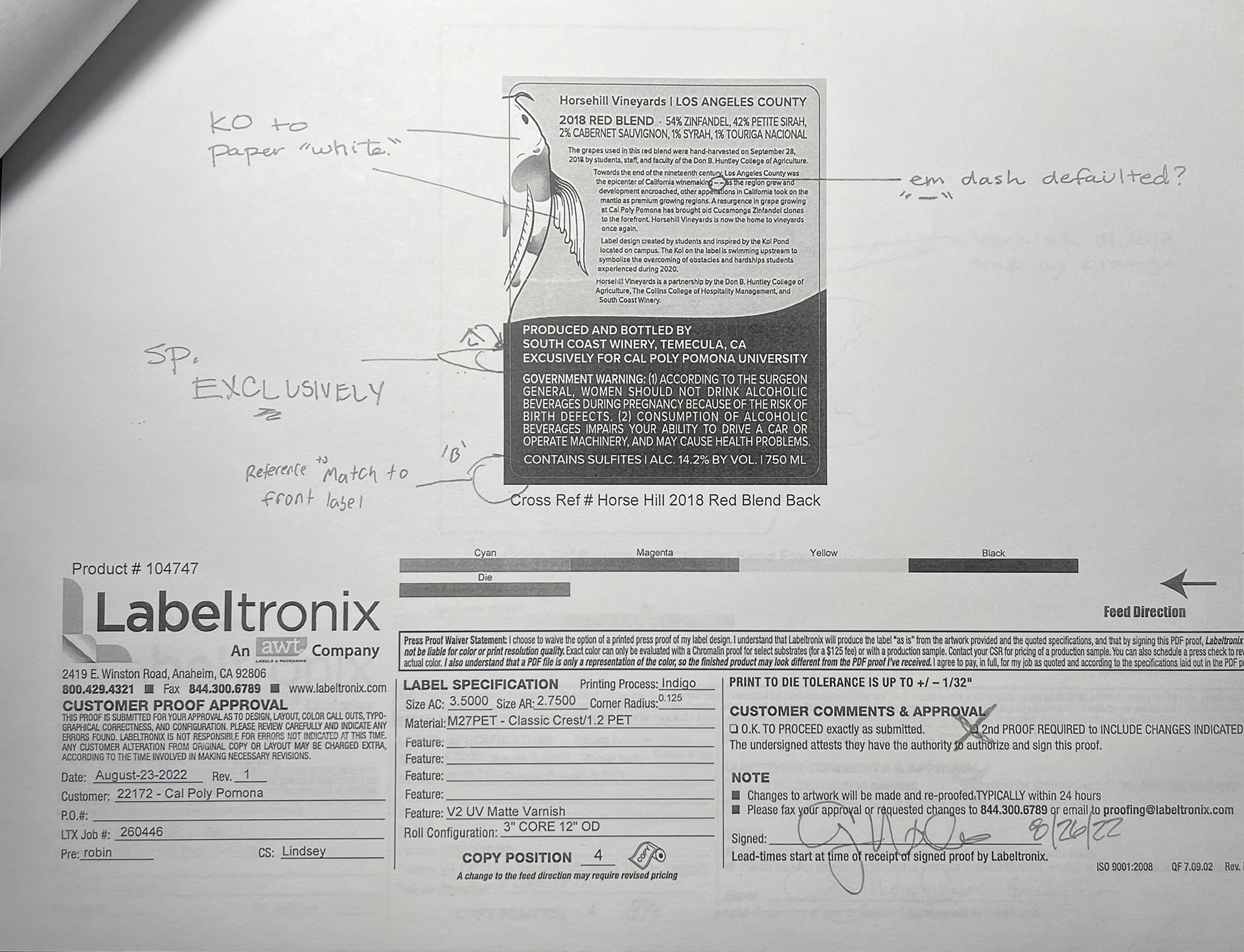
Proof & Print Operations

Final Design
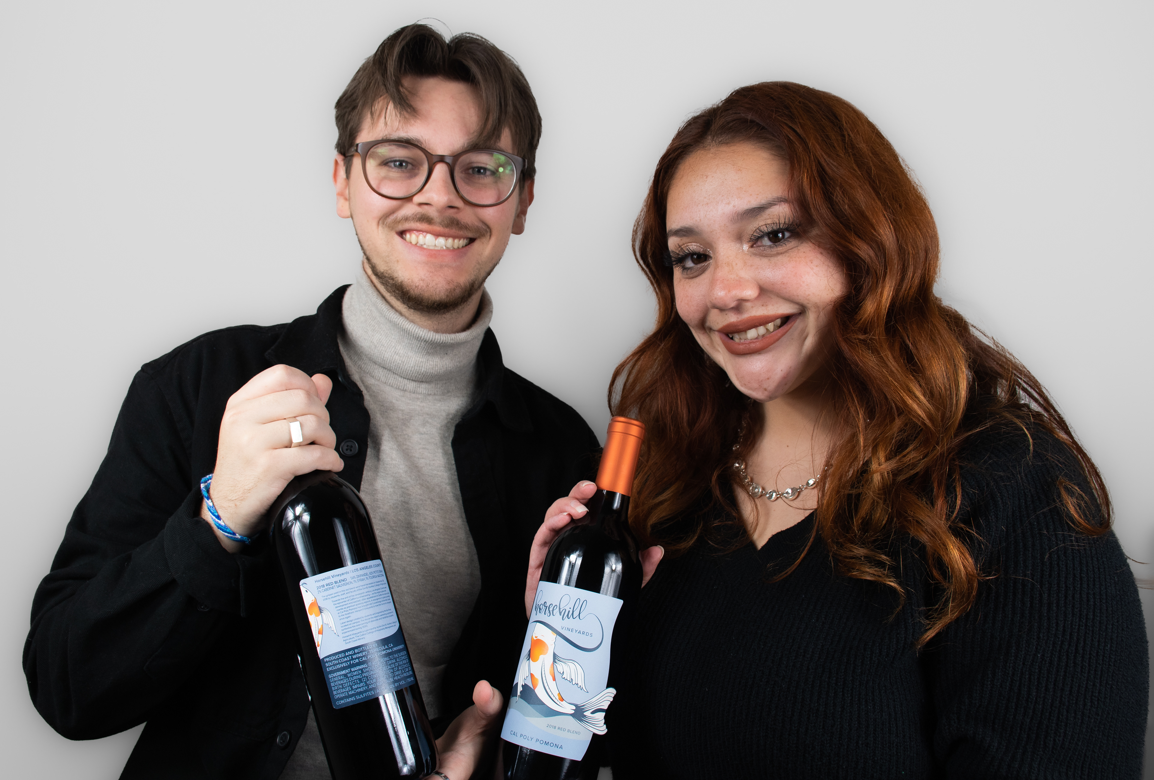
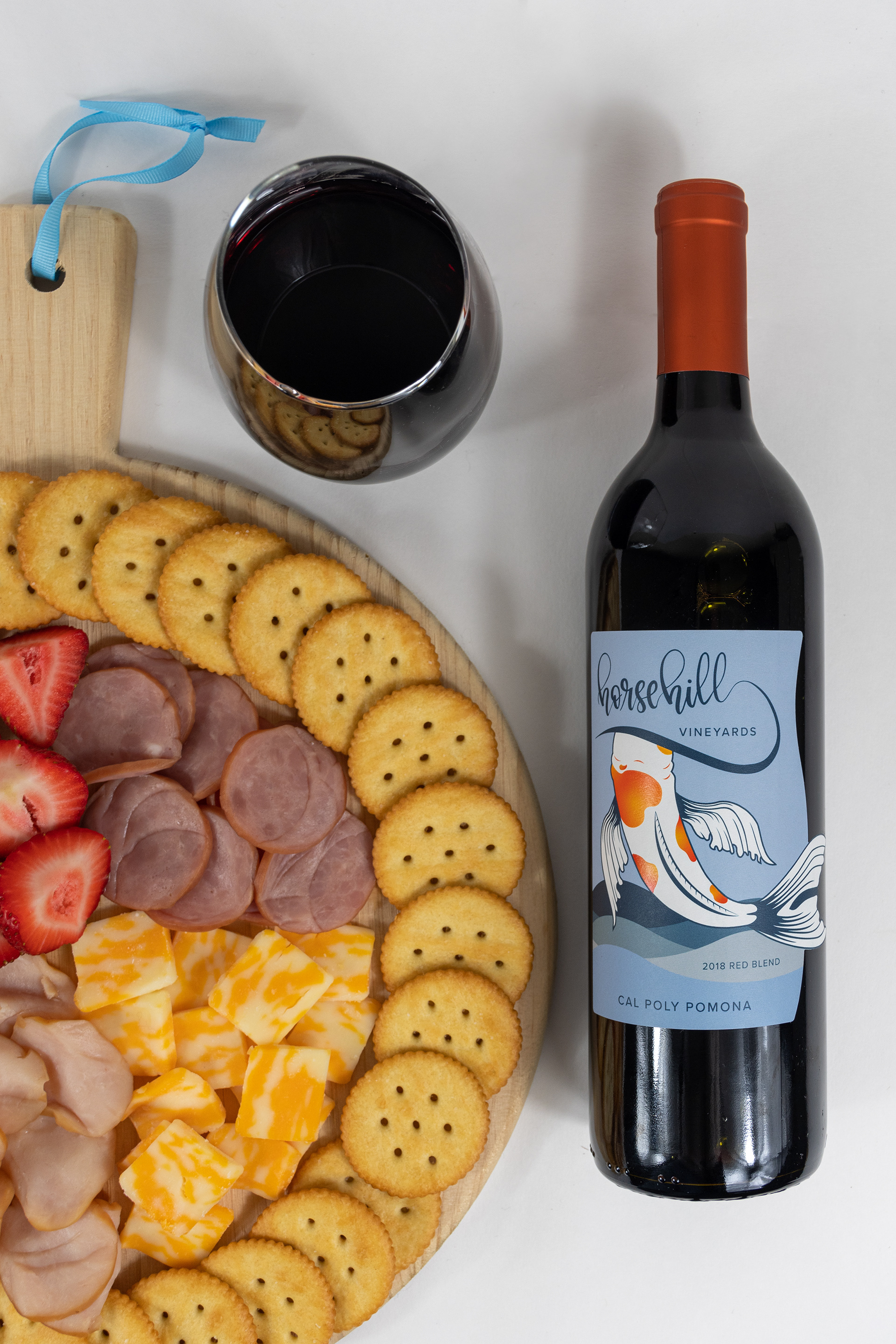
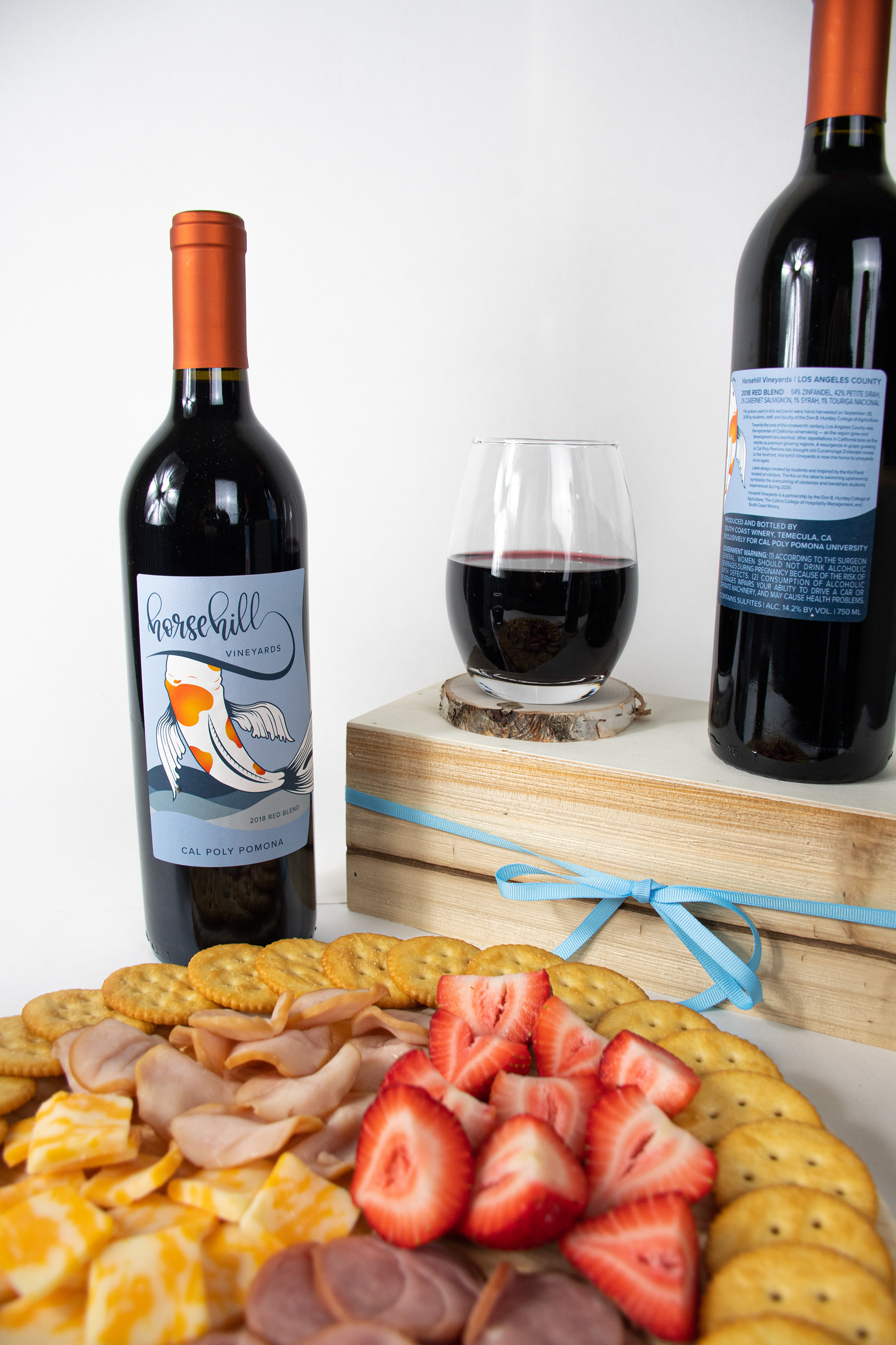
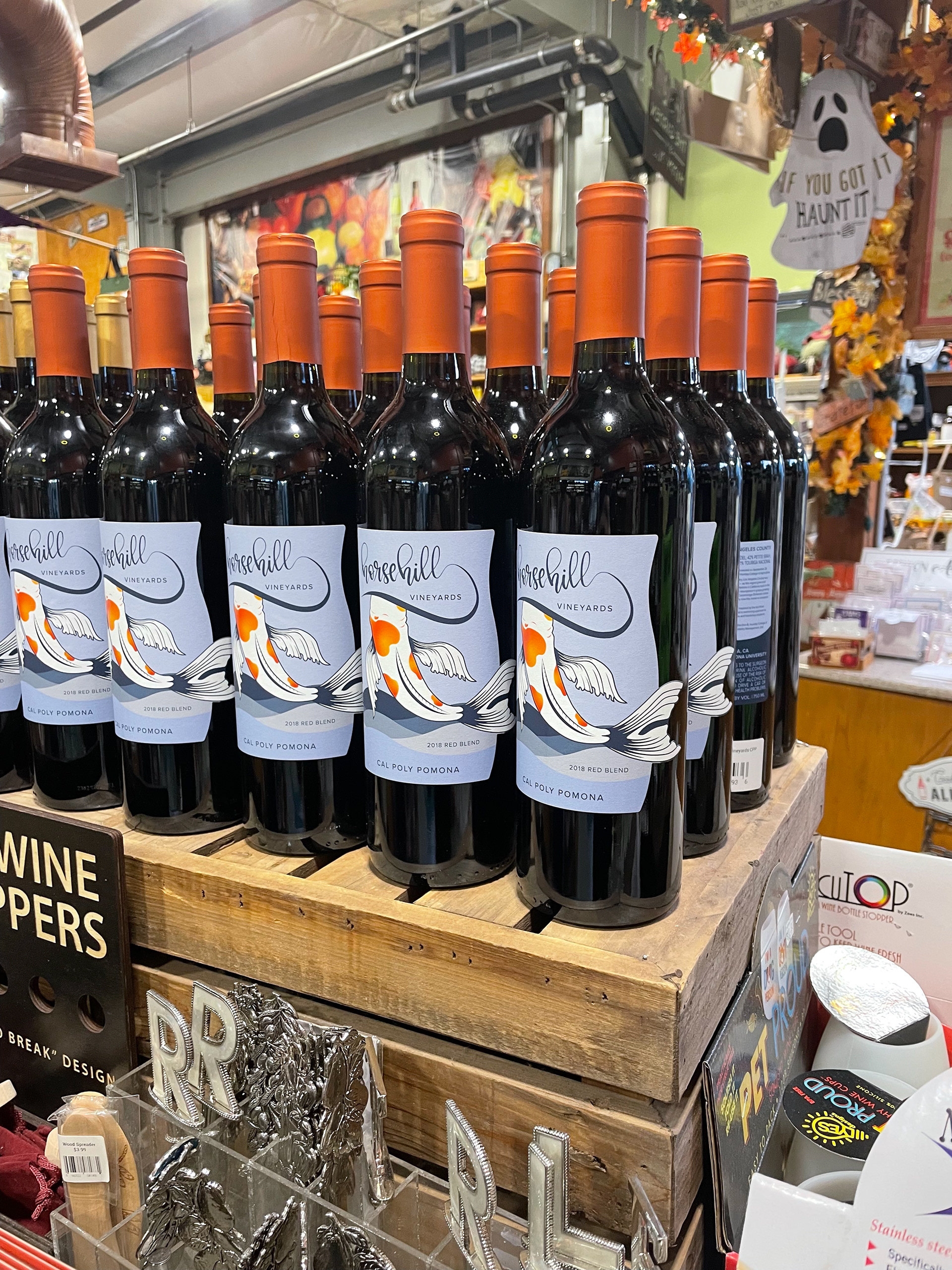
This is the final design that was printed on more than 1,000 bottles and is currently being sold at the Cal Poly Pomona Farm Store.
Thank you to the original design team Rachel Wong, Rachel Stelzer, Emma Wahlstrom, and Julia Batterson for trusting us with your work.
Thank you Sarah A. Meyer for this wonderful opportunity and learning experience.
Thank you Tyler Hughey for your creativity and dedication, I am thankful to have worked with such a talented designer.