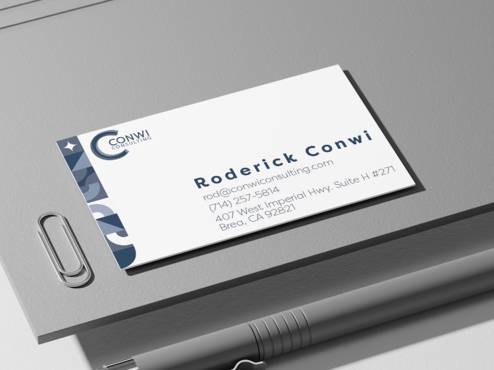
Client:
Irene Leyva PysD, LMFT.
Description:
In order to start promoting herself, therapist Irene Leyva sought me out to create business cards for her. However, after working with my client, I discovered that she desired a brand identity system instead. Working closely with my client via email and virtual meetings, I developed a logo and brand colors for Irene.
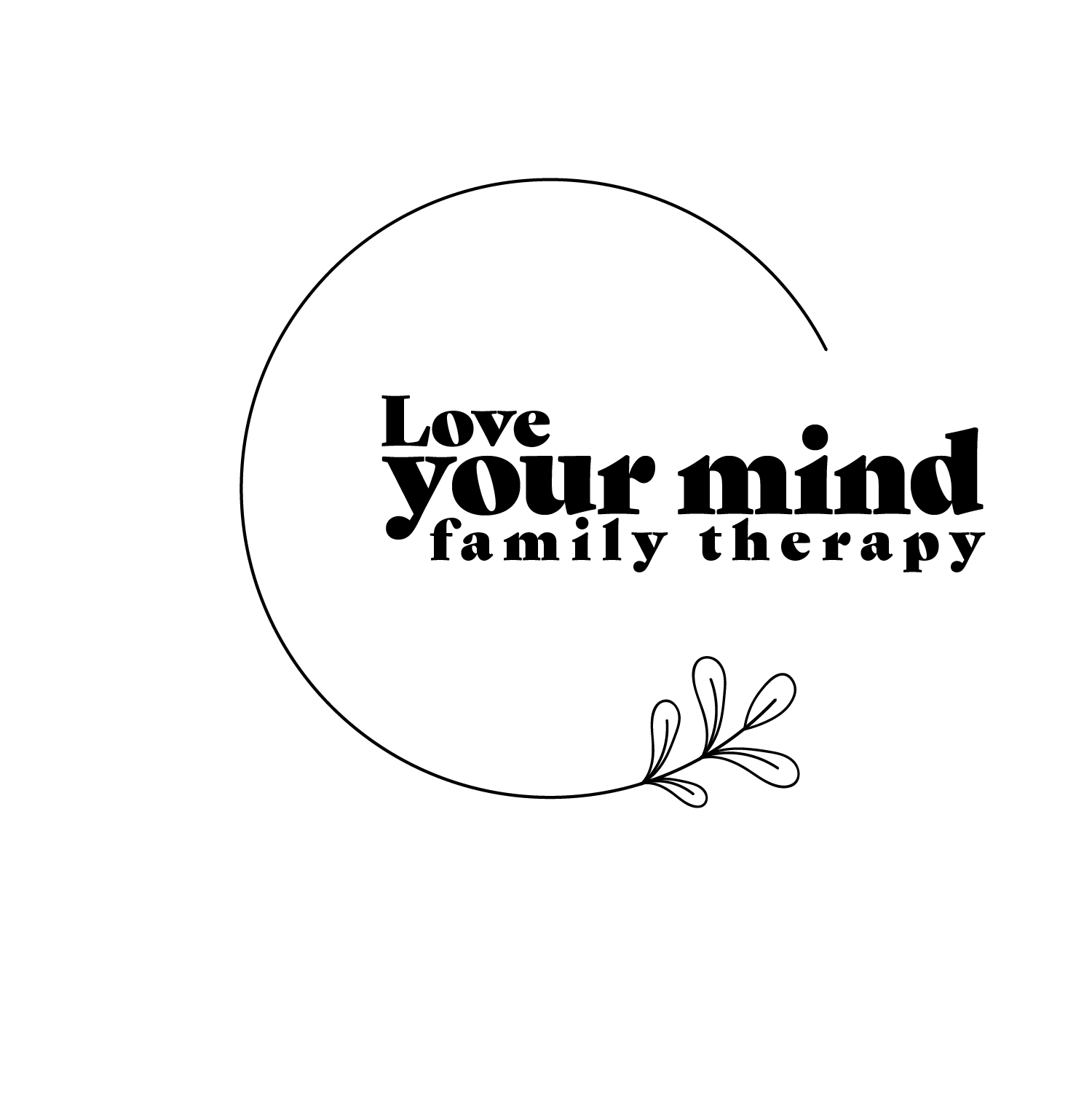
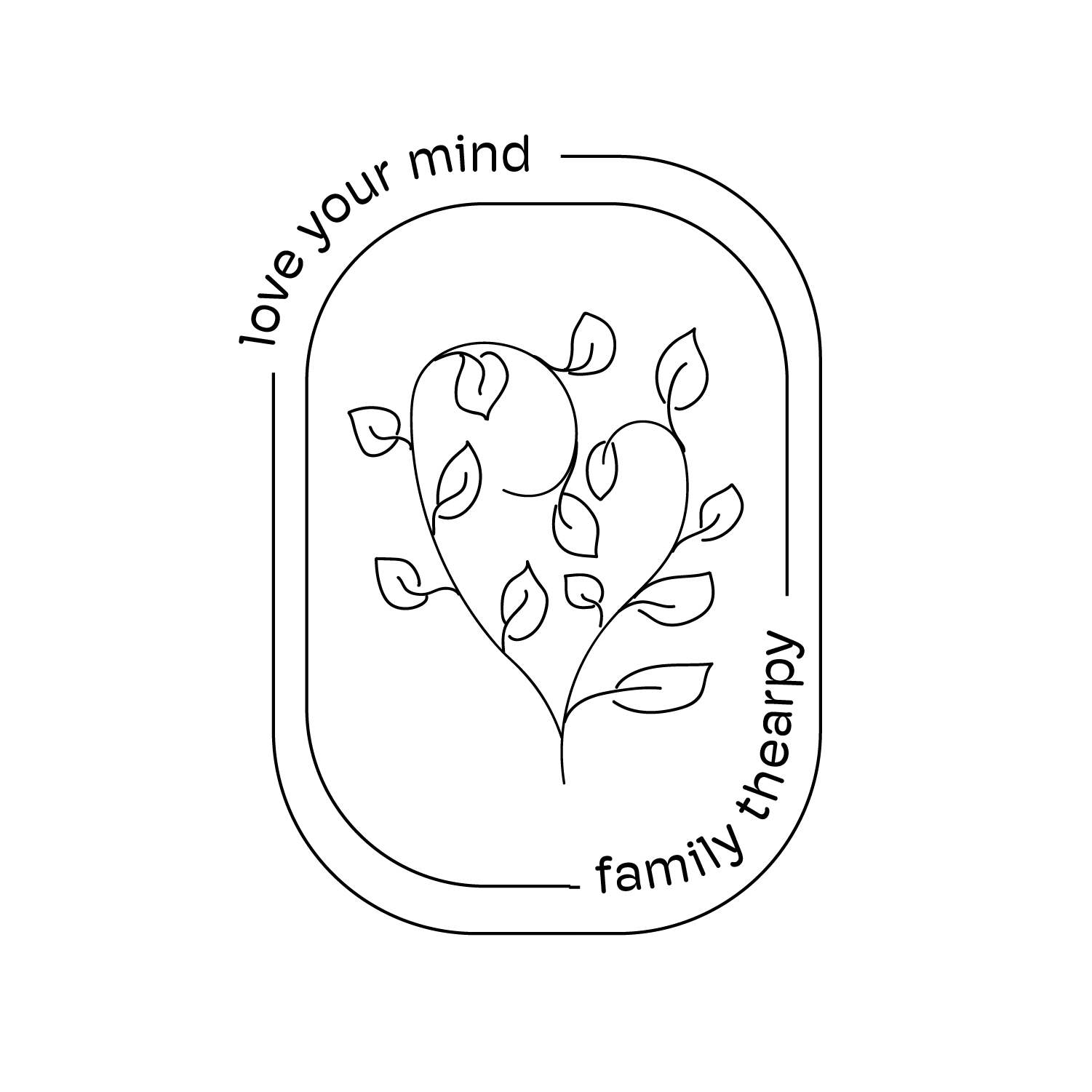
Logo Sketches
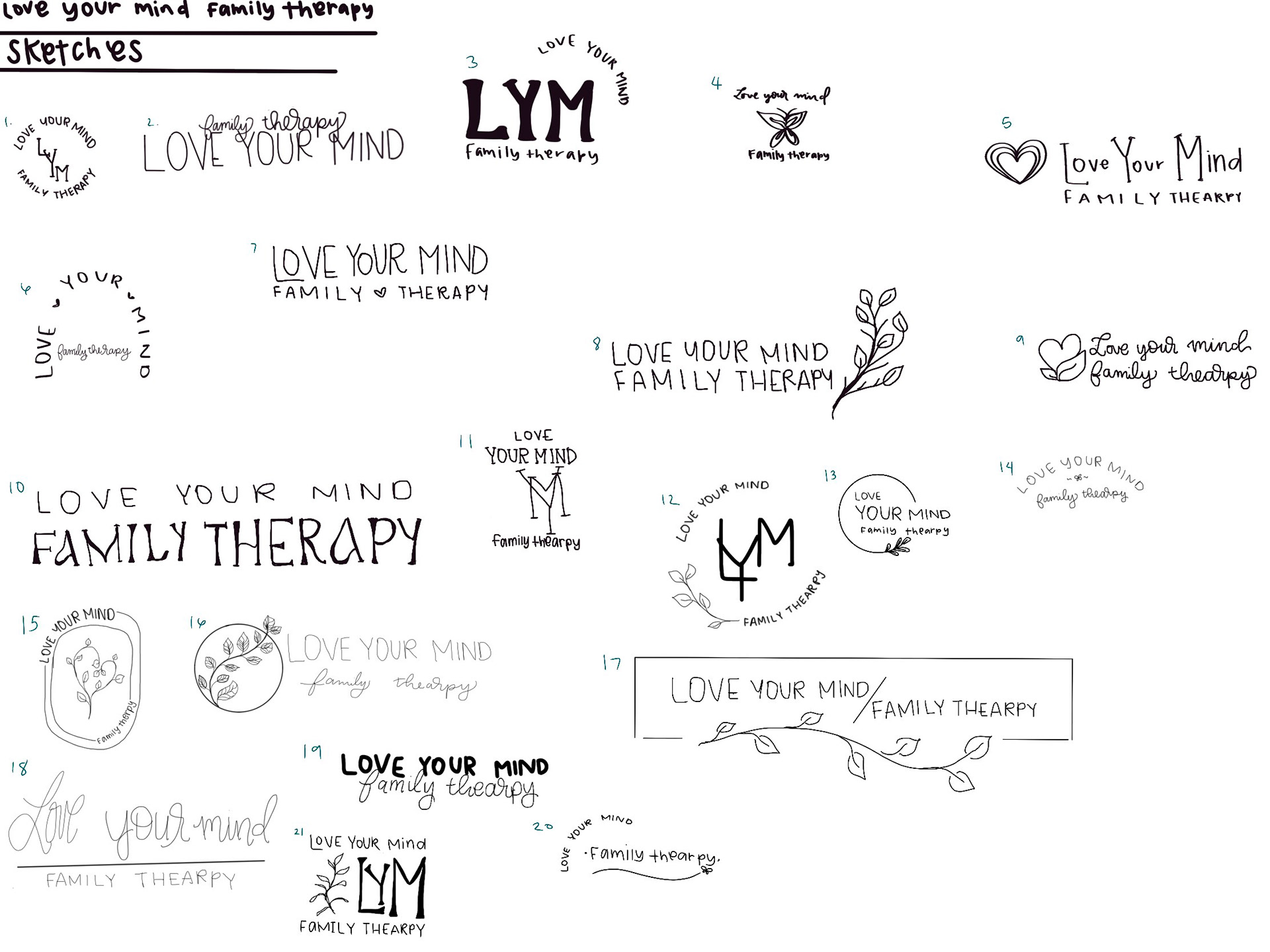
To get an idea of what my client is looking for, I send them a questionnaire to get an understanding of what they are looking for.
For me, my favorite part of starting a new design for a client is to go back to basics. Before I even get on the computer I hand draw all of the concepts that are living in my head based on what my client answered in their questionnaire.
Digital Logos
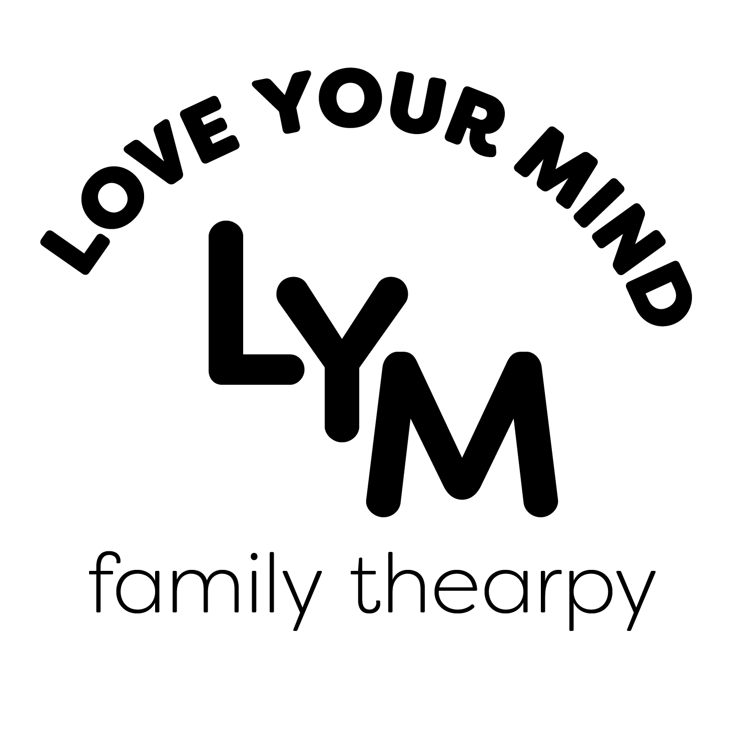
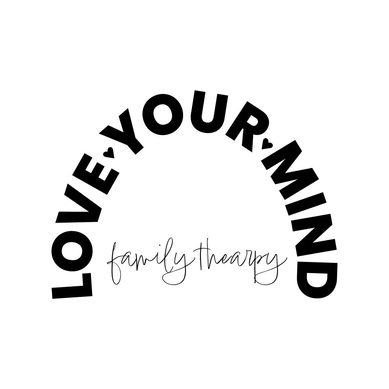

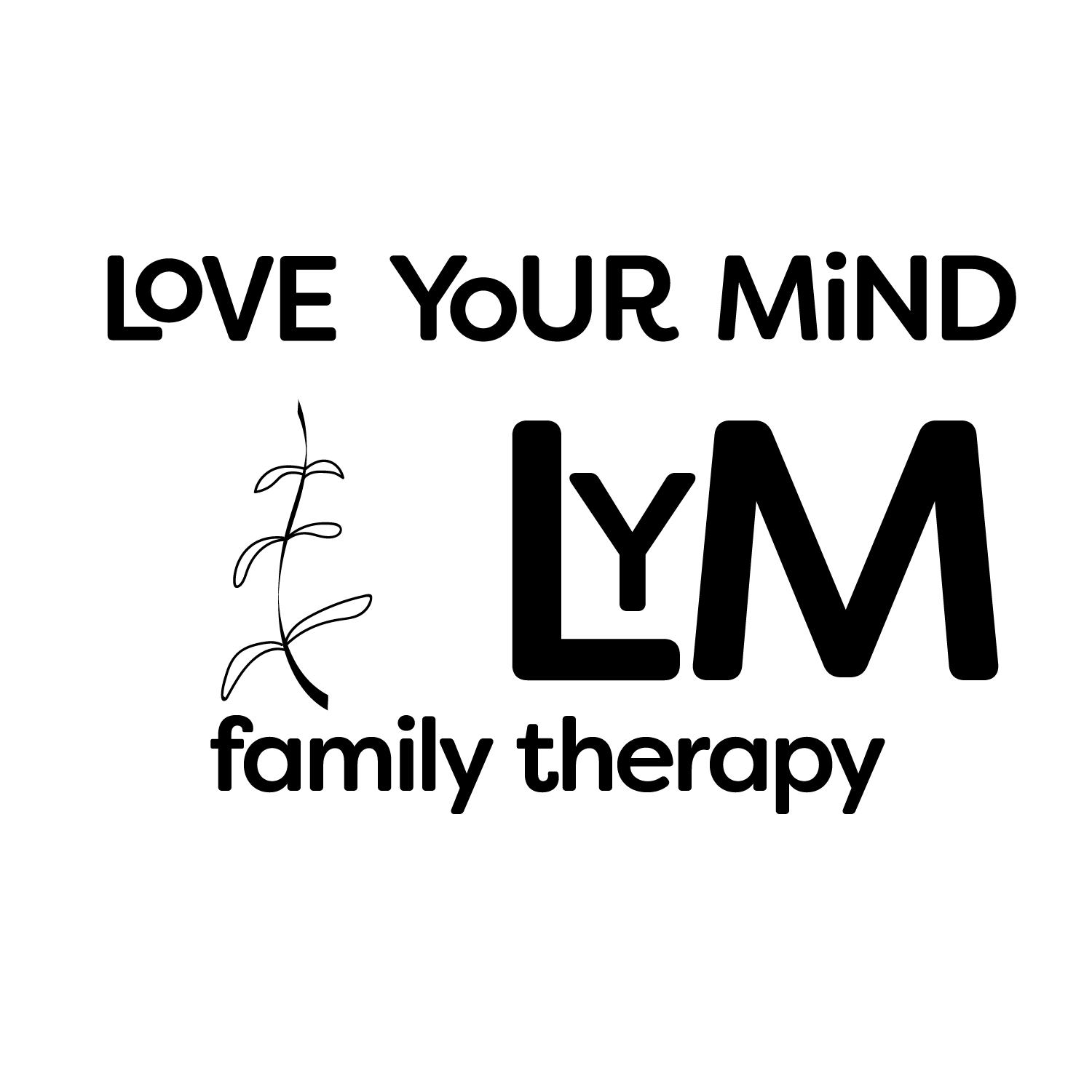
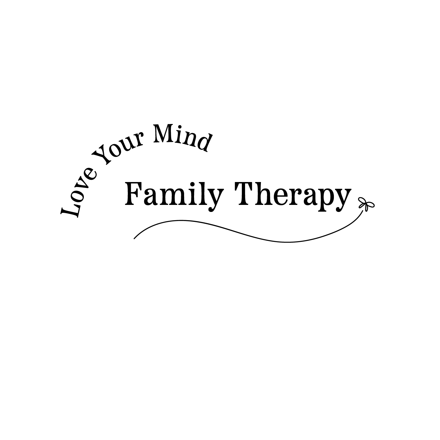
I then let my client choose her top ten favorite logos and make them digital so we can get a better idea of what the final logo will look like.
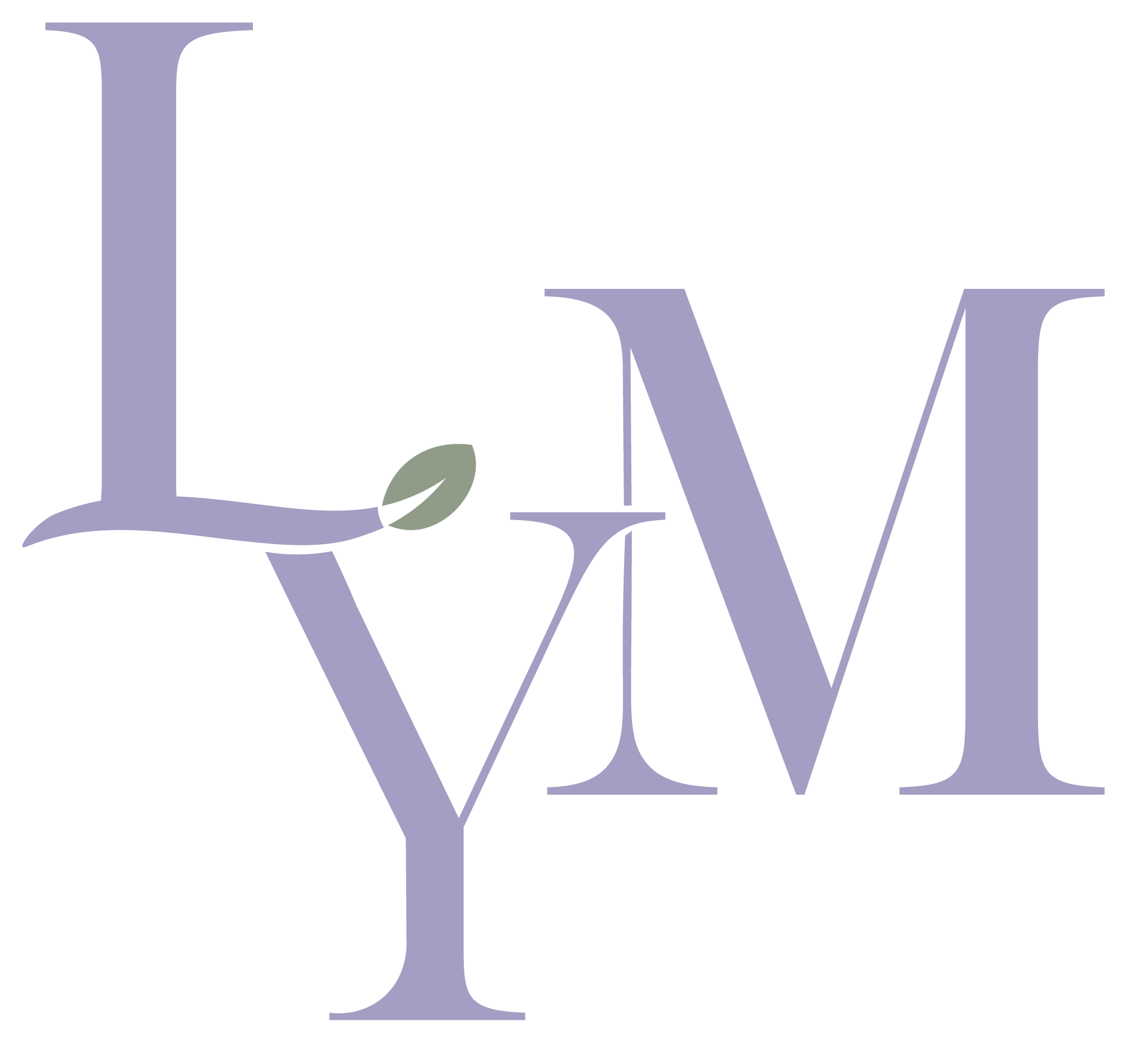
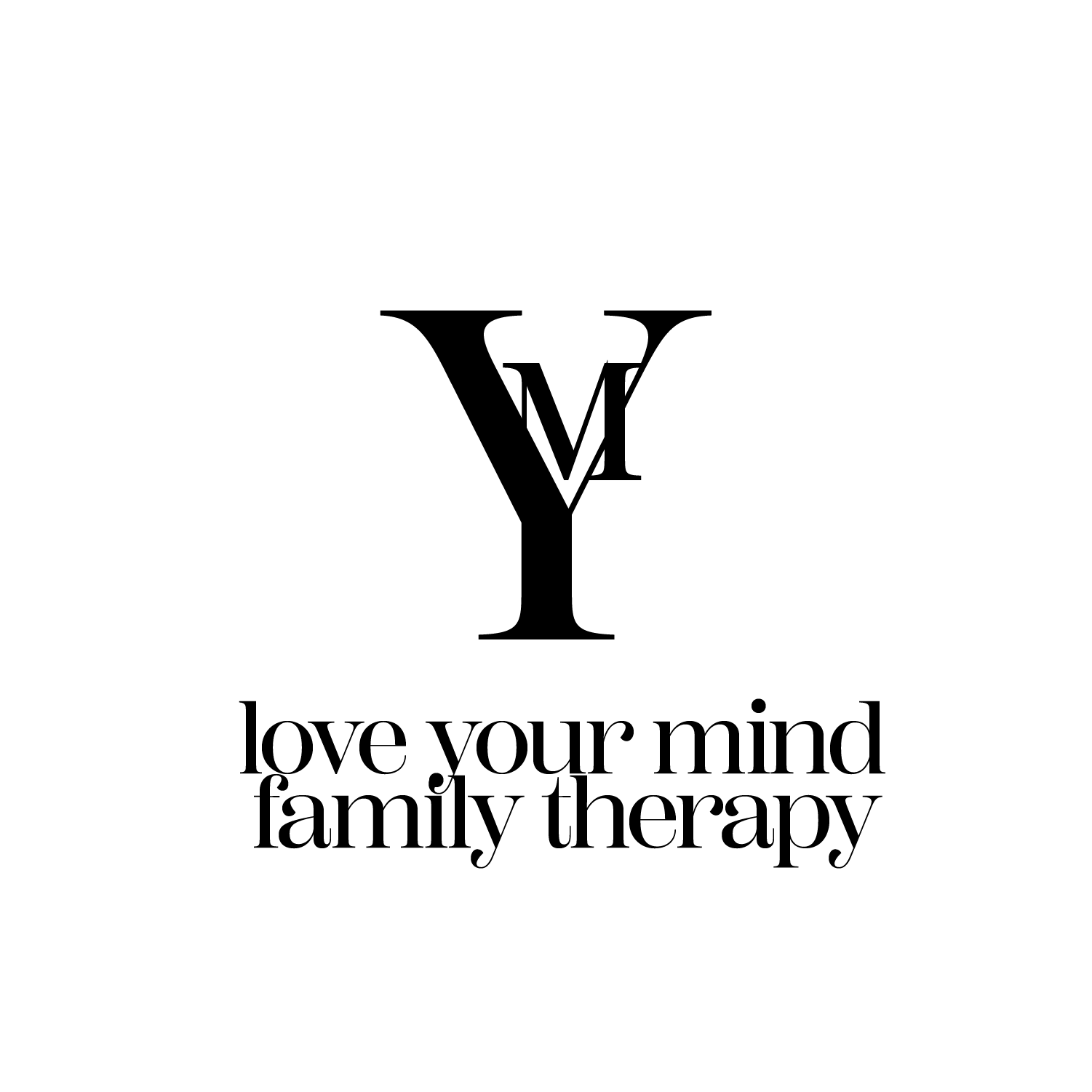
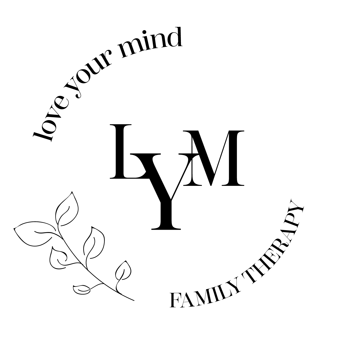
Final Logo
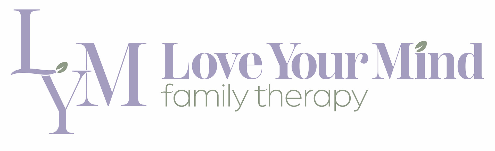
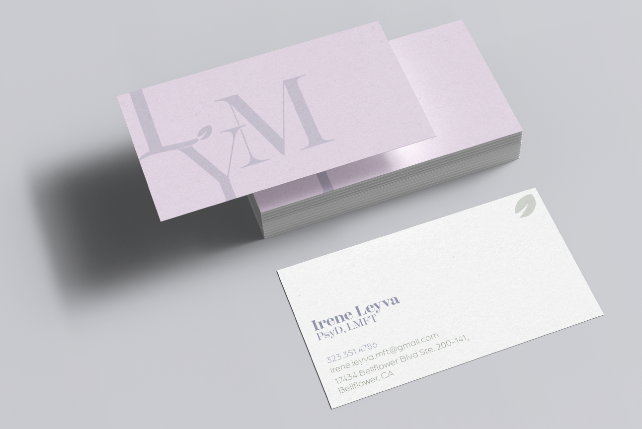
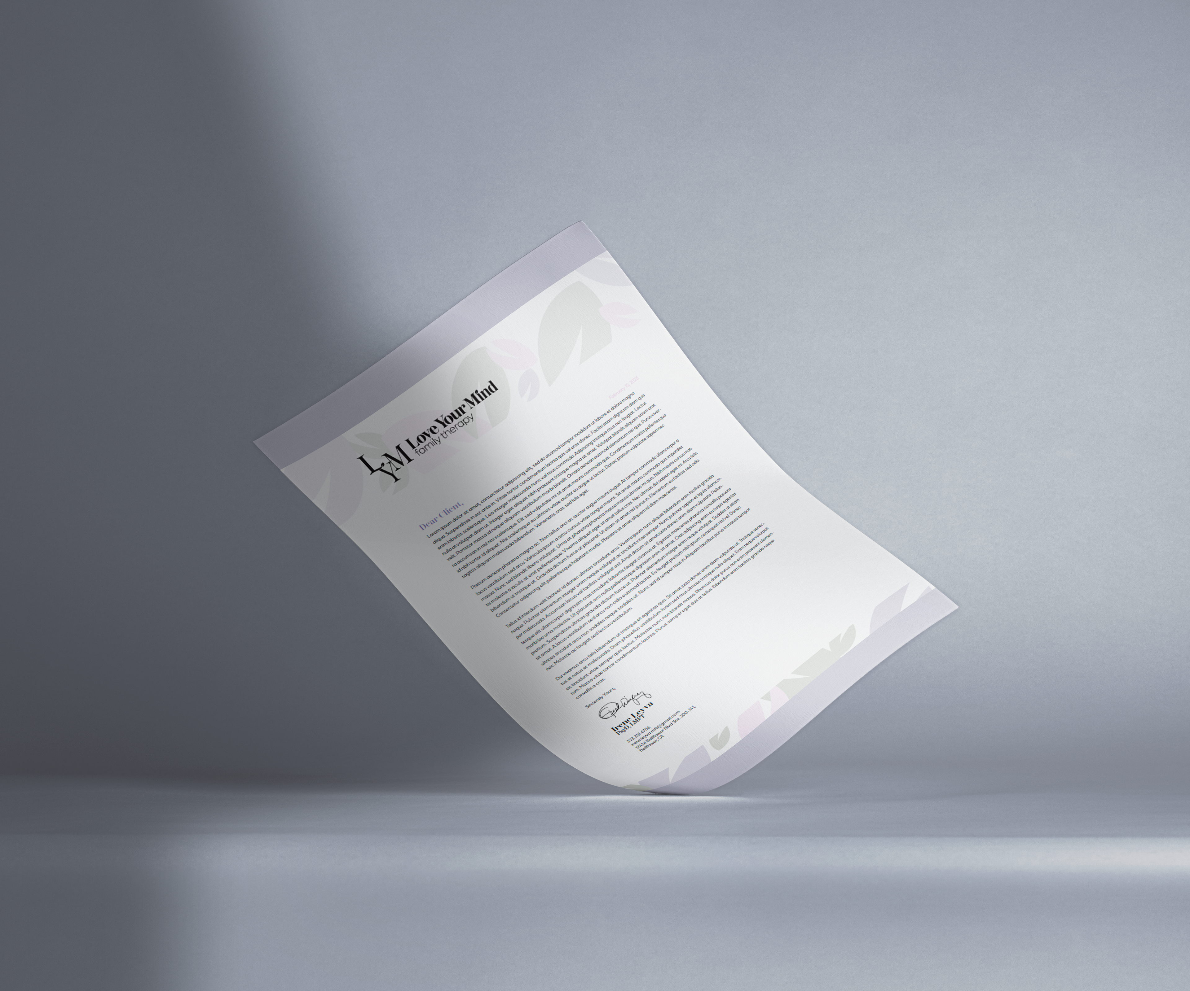
The final outcome is a beautiful serifed logo that combines elegance and sophistication. The logo has a unique look with customized serifs that add a touch of personality. I customed the beautiful 'L' to demonstrate Irene's professionalism and grace. Irene wanted the use of the leaf motif through her branding to signify that she is there to help her clients learn more about themselfevs and grow over time. The design work reflects the therapist's values and brand while also being visually appealing and easy to navigate.
Brand Colors
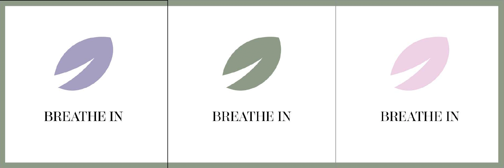
Calm colors are hues that evoke a sense of tranquility, relaxation, and peace, which are exactly what we decided on for the brand's colors. They are also associated with nature, which can help to create a peaceful atmosphere. Overall, the calm colors are an excellent choice for creating a serene and comfortable environment, which is essential for a therapist.
Final Design